Feeling uncertain about what to expect in your upcoming interview? We’ve got you covered! This blog highlights the most important DataDriven Insights interview questions and provides actionable advice to help you stand out as the ideal candidate. Let’s pave the way for your success.
Questions Asked in DataDriven Insights Interview
Q 1. Explain the difference between correlation and causation.
Correlation and causation are often confused, but they represent distinct relationships between variables. Correlation simply means that two variables tend to change together. A positive correlation indicates that as one variable increases, the other tends to increase as well. A negative correlation means that as one variable increases, the other tends to decrease. However, correlation does not imply causation. Just because two variables are correlated doesn’t mean one causes the other. There could be a third, unseen variable influencing both.
Example: Ice cream sales and crime rates are often positively correlated. Does this mean ice cream causes crime? No. The underlying cause is likely the summer heat: more ice cream is sold in hot weather, and more crime might also occur during warmer months due to increased outdoor activity. The heat is the confounding variable.
In short: Correlation shows a relationship; causation proves a cause-and-effect link. Establishing causation requires much stronger evidence, often involving controlled experiments or strong logical arguments eliminating alternative explanations.
Q 2. Describe a time you identified a significant insight from data.
During a project for an e-commerce client, we noticed a surprising correlation: customers who abandoned their shopping carts after adding a specific product (a high-end blender) were significantly more likely to make a purchase within the next 24 hours if they received a personalized email reminder featuring similar, slightly lower-priced blenders. Initially, we saw a high cart abandonment rate for this blender. By analyzing customer demographics and browsing history alongside cart abandonment data, we discovered this segment’s reluctance wasn’t due to price sensitivity, but rather a hesitation stemming from the blender’s high cost. The targeted email campaign with alternative suggestions significantly reduced the abandonment rate and boosted overall sales. This highlighted the importance of nuanced customer segmentation and tailored marketing strategies.
Q 3. How would you handle missing data in a dataset?
Handling missing data is crucial for maintaining data integrity and avoiding biased results. The best approach depends on the nature and extent of the missing data, and the context of the analysis. There’s no one-size-fits-all solution.
- Deletion: Listwise deletion (removing entire rows with missing values) is simple but can lead to substantial data loss and biased results if the missing data isn’t Missing Completely at Random (MCAR). Pairwise deletion (using available data for each analysis) can create inconsistencies.
- Imputation: This involves filling in missing values with estimated ones. Common techniques include:
- Mean/Median/Mode imputation: Simple but can distort the distribution and underestimate variance. Suitable only if data is MCAR and missing values are few.
- Regression imputation: Predicts missing values based on other variables. More sophisticated but requires assumptions about the relationships between variables.
- K-Nearest Neighbors (KNN) imputation: Finds similar data points and uses their values to estimate missing values. Robust to non-linear relationships but computationally expensive for large datasets.
- Multiple imputation: Creates multiple plausible imputed datasets, analyzing each, and combining the results to account for uncertainty in the imputation.
Before choosing a method, it’s vital to understand why data is missing. Is it random (MCAR), missing at random (MAR), or missing not at random (MNAR)? Understanding the mechanism of missingness guides the choice of imputation method. Always document the handling of missing data in your analysis report.
Q 4. What are the limitations of using only descriptive statistics?
Descriptive statistics, while valuable for summarizing data (e.g., mean, median, standard deviation), only provide a snapshot of the data’s characteristics. They don’t reveal underlying patterns, relationships, or causal inferences. They lack the ability to:
- Predict future outcomes: Descriptive statistics only describe the past; they can’t predict future trends.
- Establish causality: They show correlations, but not causal relationships.
- Identify underlying causes: They merely describe the data; they don’t explain why the data looks the way it does.
- Generalize findings: Descriptive statistics are limited to the observed data. They don’t allow you to generalize conclusions to a larger population.
For a comprehensive understanding, descriptive statistics must be supplemented with inferential statistics (hypothesis testing, regression analysis, etc.) to draw meaningful conclusions and make predictions.
Q 5. What is A/B testing and how would you design one?
A/B testing (also known as split testing) is a randomized experiment where two or more versions of a variable (e.g., a website headline, an email subject line, an ad creative) are shown to different groups of users to determine which version performs better based on a predefined metric (e.g., click-through rate, conversion rate).
Designing an A/B test involves these steps:
- Define your objective and metric: What are you trying to improve? What will you measure to assess success (e.g., conversion rate, click-through rate, time spent on page)?
- Choose your variations: Create distinct versions of the element you’re testing. Keep variations focused on testing one specific element at a time to isolate the effects.
- Determine your sample size: Use a power analysis to calculate the number of users needed in each group to detect a statistically significant difference. Insufficient sample size can lead to inaccurate conclusions.
- Randomly assign users to groups: Ensure that users are randomly allocated to each variation to avoid bias.
- Run the test: Let the test run for a sufficient period to collect enough data and avoid biases from seasonal or daily fluctuations.
- Analyze the results: Use statistical tests (e.g., t-test, chi-square test) to determine if there’s a statistically significant difference between the variations. Interpret the results with caution.
- Implement the winning variation: Once a significant difference is found, deploy the best-performing variation.
Example: An e-commerce company might A/B test two different calls to action buttons on their product page – one that says “Buy Now” and another that says “Add to Cart.” They’d track the conversion rate (percentage of users who make a purchase) for each button to see which performs better.
Q 6. Explain your experience with data visualization tools.
I have extensive experience with various data visualization tools, including Tableau, Power BI, and Python libraries like Matplotlib and Seaborn. My choice of tool depends on the specific needs of the project and the type of data being visualized.
Tableau and Power BI are excellent for creating interactive dashboards and reports that are easily shared with stakeholders who may not have technical expertise. They excel at handling large datasets and creating visually appealing charts and graphs. I’m proficient in creating various visualizations like bar charts, line charts, scatter plots, heatmaps, and geographic maps using these tools.
Python’s Matplotlib and Seaborn offer greater flexibility and customization for creating publication-quality visualizations. They are particularly useful for more complex analyses and when precise control over the visual elements is needed. I’ve used these libraries to create custom plots, adjust visual parameters, and integrate visualizations into reports and presentations.
My skillset extends to choosing the right chart type to effectively communicate the insights extracted from the data. The choice depends heavily on the type of data and the story I’m trying to convey. For example, I’d use a scatter plot to show correlations between two variables but a bar chart to compare categories.
Q 7. How do you identify and handle outliers in your data?
Outliers are data points that significantly deviate from the rest of the data. Identifying and handling them is crucial because they can skew statistical analyses and distort insights. The approach depends on the context and the likely cause of the outlier.
Identification: Outliers are often identified using visual methods (scatter plots, box plots) or statistical methods:
- Box plots: Visually identify points beyond the whiskers (typically 1.5 times the interquartile range from the quartiles).
- Z-scores: Data points with Z-scores greater than a certain threshold (e.g., 3) are considered outliers. This assumes the data is normally distributed.
- Interquartile range (IQR): Points outside a defined range based on the IQR are considered outliers.
Handling: The best approach depends on the nature and likely cause of the outlier:
- Investigation: Examine potential reasons for the outlier. Is it due to measurement error, data entry mistakes, or a genuinely unusual observation?
- Removal: If an outlier is clearly due to an error, removing it is justified. However, this should be done cautiously and documented.
- Transformation: Applying a transformation (e.g., logarithmic transformation) to the data can sometimes reduce the influence of outliers.
- Winsorizing or Trimming: Replacing extreme values with less extreme ones (Winsorizing) or removing a percentage of extreme values (Trimming) are other options.
- Robust statistical methods: Use statistical methods less sensitive to outliers (e.g., median instead of mean, robust regression).
It is imperative to justify any outlier handling method used, as improperly handling outliers can lead to incorrect or misleading conclusions. Always document your decisions and the reasons behind them.
Q 8. Describe your experience with different types of data (structured, unstructured).
My experience encompasses a wide range of data types, both structured and unstructured. Structured data is easily organized into rows and columns, think of a neatly organized spreadsheet or a relational database table. I’ve worked extensively with this type of data, leveraging SQL to query and analyze datasets from various sources, including customer relationship management (CRM) systems and transactional databases. For instance, I once analyzed a large CRM dataset to identify high-value customers based on purchase history and engagement metrics.
Unstructured data, on the other hand, lacks a predefined format and is far more complex to manage. This includes text documents, images, audio files, and social media posts. I’ve used techniques like natural language processing (NLP) to extract insights from textual data, image recognition to analyze visual data, and sentiment analysis to understand customer opinions from social media comments. For example, I successfully used NLP to analyze customer reviews to identify areas for product improvement and improve customer satisfaction. My experience spans various tools and technologies for handling both types, ensuring efficient data processing and analysis.
Q 9. What is your preferred method for data cleaning?
My preferred method for data cleaning is a systematic, multi-step approach that emphasizes accuracy and reproducibility. It starts with a thorough understanding of the data’s origin and intended use. I then employ a combination of techniques. First, I address missing values. This can involve imputation using methods like mean/median/mode substitution for numerical data, or using more sophisticated techniques like k-Nearest Neighbors for more complex scenarios. For categorical data, I may choose to replace missing values with a new category, like ‘Unknown’.
Next, I handle outliers, using techniques like box plots and Z-score calculations to identify unusual values. Depending on the context, I might remove, cap, or winsorize these outliers. Data transformation is also crucial. This may include normalization or standardization of numerical variables to ensure they have similar scales and avoid bias. Lastly, I identify and correct inconsistencies, such as typos or formatting errors in text data, and ensure data type consistency. I always document each step of the cleaning process, ensuring repeatability and transparency.
Throughout this process, I rely heavily on data visualization techniques to gain a better understanding of the data and identify potential issues. This allows for informed decisions during the cleaning process. The entire workflow is meticulously documented and version-controlled, facilitating collaboration and ensuring reproducibility.
Q 10. Explain the difference between supervised and unsupervised machine learning.
Supervised and unsupervised machine learning differ fundamentally in how they learn from data. In supervised learning, the algorithm learns from a labeled dataset, meaning each data point is associated with a known outcome or target variable. This allows the algorithm to learn the relationship between the input features and the target variable and make predictions on new, unseen data. Think of it like learning with a teacher who provides the correct answers. A common example is image classification, where the algorithm learns to identify different types of objects (the target variable) from labeled images (input features).
Unsupervised learning, conversely, works with unlabeled data. The algorithm aims to discover hidden patterns, structures, or relationships in the data without prior knowledge of the outcomes. This is like exploring a new city without a map – the algorithm is figuring things out on its own. Clustering is a classic example of unsupervised learning, where the algorithm groups similar data points together based on their inherent characteristics. For example, customer segmentation is a common application, grouping customers with similar purchasing behaviors together.
Q 11. What is your experience with SQL and database querying?
I have extensive experience with SQL and database querying, using it daily to extract, transform, and load (ETL) data from various sources. I’m proficient in writing complex queries involving joins, subqueries, aggregations, and window functions to retrieve specific insights from large datasets. I am familiar with various database systems including MySQL, PostgreSQL, and SQL Server. For example, I routinely use SQL to join customer data with transaction data to analyze purchasing patterns and identify trends. Beyond basic querying, I leverage stored procedures and functions for efficiency and maintainability. Furthermore, I understand the importance of database optimization for query performance and have experience implementing techniques to improve query speed and efficiency.
Q 12. How familiar are you with statistical modeling techniques (e.g., regression, classification)?
I’m very familiar with various statistical modeling techniques, including regression and classification algorithms. Regression models are used to predict a continuous outcome variable, such as predicting house prices based on features like size and location. I have experience with linear regression, polynomial regression, and logistic regression. Classification models, on the other hand, predict a categorical outcome, such as classifying emails as spam or not spam. I’ve worked with algorithms like logistic regression, support vector machines (SVMs), decision trees, and random forests. I understand the underlying assumptions of these models, and I know how to assess model performance using metrics like R-squared, accuracy, precision, recall, and AUC. Model selection and evaluation are crucial steps in my workflow, and I utilize techniques such as cross-validation to ensure robustness.
Q 13. What is your experience with data mining techniques?
My experience with data mining techniques is broad, encompassing various methods used to extract knowledge and patterns from large datasets. This includes association rule mining, using algorithms like Apriori to discover relationships between items (e.g., finding which products are frequently bought together). I’ve also used clustering algorithms like k-means and hierarchical clustering to group similar data points. Furthermore, I’m experienced in anomaly detection, identifying unusual or unexpected data points that deviate from the norm. In a project involving fraud detection, I successfully used anomaly detection techniques to identify fraudulent transactions. The choice of technique always depends on the specific problem and the characteristics of the data.
Q 14. How do you measure the success of a data-driven initiative?
Measuring the success of a data-driven initiative is crucial and requires a multi-faceted approach, focusing both on quantitative and qualitative metrics. Quantitatively, I assess the impact based on key performance indicators (KPIs) that are directly tied to the initiative’s objectives. For example, if the goal was to improve customer retention, I would track metrics such as churn rate, customer lifetime value (CLTV), and Net Promoter Score (NPS). If the objective was to increase sales, then metrics like conversion rates and revenue growth would be important.
Beyond quantitative measures, qualitative feedback is also essential. This may involve gathering feedback from stakeholders, conducting user surveys, or conducting A/B testing to compare different approaches. For example, if the initiative involves a new product recommendation engine, I would assess customer satisfaction with the recommendations. Finally, the overall success is also evaluated in terms of the return on investment (ROI), comparing the costs associated with the initiative against the value generated.
Q 15. Describe a situation where you had to communicate complex data findings to a non-technical audience.
Communicating complex data findings to a non-technical audience requires translating technical jargon into plain language and focusing on the story the data tells, not just the numbers themselves. For example, I once had to present the results of a customer churn analysis to a marketing team. Instead of overwhelming them with regression coefficients and p-values, I focused on actionable insights. I used visuals like charts showing the percentage of customers churning each month, segmented by key demographics. I explained these trends in simple terms: “We’re losing about 15% of our younger customers each month, and this is significantly higher than for older demographics.” Then, I proposed specific marketing campaigns – based on the data – targeting those younger customers. By focusing on the narrative and its implications for their work, I ensured the team understood and embraced the findings.
Another key is to use compelling visuals. Instead of tables packed with numbers, I prefer using clear and concise charts, graphs, and dashboards that highlight key trends and patterns. Think of it like storytelling – you want to guide the audience through your analysis, revealing the most important insights along the way. Keeping it concise and focused on the business impact is paramount. Finally, I always make myself available for questions to clarify any confusion or concerns.
Career Expert Tips:
- Ace those interviews! Prepare effectively by reviewing the Top 50 Most Common Interview Questions on ResumeGemini.
- Navigate your job search with confidence! Explore a wide range of Career Tips on ResumeGemini. Learn about common challenges and recommendations to overcome them.
- Craft the perfect resume! Master the Art of Resume Writing with ResumeGemini’s guide. Showcase your unique qualifications and achievements effectively.
- Don’t miss out on holiday savings! Build your dream resume with ResumeGemini’s ATS optimized templates.
Q 16. What are some common biases in data analysis, and how do you mitigate them?
Data analysis is susceptible to several biases. Confirmation bias, where we favor information confirming our pre-existing beliefs, is a common one. To mitigate this, I actively seek out contradictory evidence and challenge my own assumptions. Selection bias arises when the sample data doesn’t accurately represent the population. I address this by ensuring my sampling methods are rigorous and representative. Survivorship bias focuses only on successful outcomes, ignoring failures. I counteract this by explicitly considering and analyzing failures alongside successes. Finally, overfitting occurs when a model is too complex and fits the training data too well, leading to poor generalization. I use techniques like cross-validation and regularization to prevent this. In essence, my approach involves a critical and self-aware process of questioning my assumptions, methodologies, and interpretations throughout the entire data analysis lifecycle.
Q 17. Explain your experience with big data technologies (e.g., Hadoop, Spark).
My experience with big data technologies centers around Hadoop and Spark. I’ve used Hadoop’s Distributed File System (HDFS) for storing and managing large datasets, leveraging its fault tolerance and scalability to process massive amounts of data efficiently. I’ve worked with MapReduce for parallel processing of these datasets, handling tasks like data cleaning, transformation, and aggregation. For example, I once used Hadoop to process a terabyte-scale dataset of web server logs to analyze user behavior and identify patterns. Spark, with its in-memory processing capabilities, significantly improved performance on iterative algorithms. I’ve used PySpark, Spark’s Python API, extensively for data manipulation, machine learning model building, and real-time data streaming. A project involving fraud detection employed Spark’s streaming capabilities to analyze financial transactions in real-time, flagging suspicious activities. In both cases, understanding the strengths and weaknesses of each technology and choosing the right tool for the specific job was crucial.
Q 18. What is your experience with cloud computing platforms (e.g., AWS, Azure, GCP)?
I have extensive experience with AWS, specifically using services like S3 for data storage, EC2 for compute resources, and EMR for running Hadoop and Spark clusters. I’ve designed and implemented data pipelines using AWS Glue and managed data warehouses with Redshift. For example, I built an end-to-end data analytics solution on AWS for a client, handling data ingestion, processing, and visualization. While my experience with Azure and GCP is less extensive, I’m familiar with their core services and could quickly adapt my skills to those platforms. I understand that the optimal cloud provider choice depends heavily on specific project requirements and budget considerations. My approach focuses on understanding the specific needs of a project before selecting a platform and utilizing the most efficient and cost-effective tools.
Q 19. How do you prioritize different data analysis tasks?
Prioritizing data analysis tasks requires a structured approach. I typically use a combination of methods. Firstly, I align tasks with business priorities. Tasks that directly support key business objectives receive higher priority. Then, I assess the potential impact of each task. High-impact tasks, likely to yield significant insights or drive actionable changes, are prioritized. Thirdly, I consider the feasibility and resource requirements. Tasks with readily available data and fewer dependencies are tackled first. Lastly, I use a MoSCoW method (Must have, Should have, Could have, Won’t have) to categorize tasks based on their importance and urgency. This helps clearly define which tasks are essential, which are desirable, and which can be deferred.
Q 20. How do you ensure data quality and accuracy?
Ensuring data quality and accuracy is critical. My approach is multi-faceted. It begins with data profiling, understanding the data’s structure, quality, and potential issues. Then, I implement data validation rules and checks to catch errors during data ingestion and transformation. I use data cleaning techniques to handle missing values, outliers, and inconsistencies. Data standardization is essential to ensure consistency in formats and values. I utilize version control to track changes and maintain data integrity. Regular data quality audits, using various metrics and checks, identify potential issues and help maintain data quality over time. I advocate for a proactive approach, building in quality checks throughout the data pipeline rather than addressing issues only after they arise.
Q 21. What are some common metrics used to evaluate the performance of a model?
The choice of metrics depends heavily on the model’s objective. For classification models, common metrics include accuracy, precision, recall, F1-score, and AUC-ROC. Accuracy measures the overall correctness, while precision focuses on the proportion of true positives among predicted positives. Recall measures the proportion of true positives identified among all actual positives. The F1-score balances precision and recall. AUC-ROC evaluates the model’s ability to distinguish between classes across various thresholds. For regression models, common metrics include mean squared error (MSE), root mean squared error (RMSE), mean absolute error (MAE), and R-squared. MSE and RMSE measure the average squared and square root of squared differences between predicted and actual values, respectively. MAE measures the average absolute difference. R-squared indicates the proportion of variance in the dependent variable explained by the model. Selecting the right metrics is critical to accurately evaluating model performance and selecting the best model for a particular task.
Q 22. How would you approach a problem where you have limited data?
Limited data is a common challenge in data-driven insights. The key is to maximize the information you can extract from what you have. My approach involves a multi-pronged strategy:
- Data Augmentation: I would explore techniques to artificially increase the dataset’s size. This might involve synthetic data generation, if appropriate for the problem, or carefully considering whether to oversample minority classes if dealing with class imbalance. For example, in image recognition, augmentations like rotations and flips can increase the dataset size without collecting new data.
- Feature Engineering: Instead of relying on raw data, I would focus on creating new features that capture more information. For instance, instead of raw sales figures, I might create features like ‘average daily sales’ or ‘sales per customer segment’.
- Robust Algorithms: I’d select machine learning algorithms specifically designed to work well with small datasets. These often include simpler models like linear regression, logistic regression, or decision trees, which are less prone to overfitting than complex models like deep neural networks. Regularization techniques, like L1 and L2 regularization, can also help prevent overfitting.
- Careful Evaluation: With limited data, it’s crucial to use appropriate cross-validation techniques to get a reliable estimate of model performance. k-fold cross-validation is a common approach that ensures all data points are used for both training and testing.
- Domain Expertise: Leveraging existing domain knowledge is essential. Understanding the context of the data allows for informed feature selection and interpretation of results, even with limited data points. For example, knowing that specific demographics are more likely to churn can help shape feature engineering and model selection.
Ultimately, the best approach depends on the specific problem and the nature of the limited data. It’s a balancing act between model complexity, the risk of overfitting, and the need to extract meaningful insights.
Q 23. Describe your experience working with different types of data visualization charts.
I’ve extensive experience with various data visualization charts, choosing the right chart depends heavily on the data and the message I want to convey. Here are some examples:
- Bar charts and column charts: Ideal for comparing discrete categories or groups. For example, comparing sales across different regions.
- Line charts: Excellent for showing trends over time, such as website traffic or stock prices.
- Scatter plots: Useful for exploring the relationship between two continuous variables. For example, showing the correlation between advertising spend and sales.
- Pie charts: Effective for showing proportions of a whole, for instance, the market share of different companies.
- Histograms: Show the distribution of a single continuous variable. Useful for identifying outliers or understanding data skewness.
- Heatmaps: Visualize data in a matrix format, useful for showing correlations or patterns across multiple variables. For instance, a customer segmentation heatmap displaying the relationship between different customer demographics and purchase behavior.
- Box plots: Useful for comparing the distribution of multiple groups simultaneously, especially showing median, quartiles and outliers. For example comparing the distribution of customer satisfaction scores across different product lines.
Beyond these basic charts, I’m also proficient in more advanced visualizations like network graphs and geographic maps, adapting my choice to the specific analytical needs of the project.
Q 24. What is your experience with data storytelling and presentation?
Data storytelling and presentation are crucial for effectively communicating data-driven insights. My approach focuses on translating complex data into a clear, concise, and compelling narrative. I start by identifying the key message or takeaway, structuring the presentation to build towards this conclusion. I use visualizations strategically to support the narrative, avoiding chart junk and ensuring clear labeling.
For instance, when presenting churn predictions, I wouldn’t just show a table of numbers. Instead, I’d start with a high-level summary of the overall churn rate, then drill down into specific segments or factors driving churn, using charts and graphs to highlight key trends. A compelling story might include examples of specific customer segments or scenarios to make the data more relatable and memorable. I always tailor the level of detail and technicality to my audience. A technical audience might appreciate statistical details, while a business audience might prefer focusing on high-level trends and actionable recommendations.
Finally, practicing the presentation and anticipating potential questions are critical steps to ensure a successful and impactful delivery. I believe interactive dashboards and data visualizations can significantly improve the communication process and facilitate deeper engagement from stakeholders.
Q 25. How do you stay up-to-date with the latest trends in data analytics?
Staying current in the rapidly evolving field of data analytics requires a multifaceted approach:
- Online Courses and Webinars: Platforms like Coursera, edX, and DataCamp offer courses on cutting-edge techniques and technologies. Webinars and online seminars from industry leaders keep me updated on the latest trends.
- Industry Publications and Blogs: I regularly read publications like Towards Data Science, Analytics Vidhya, and journals like the Journal of the American Statistical Association to stay informed about new research and best practices.
- Conferences and Workshops: Attending industry conferences and workshops provide opportunities to network with peers, learn from experts, and discover emerging technologies.
- Professional Networks: Active participation in online communities and forums (like Stack Overflow, Kaggle) exposes me to diverse perspectives and challenges, helping me broaden my knowledge and skills.
- Experimentation and Projects: I regularly engage in personal projects using the newest technologies and techniques, enabling me to test and evaluate their efficacy in practical scenarios.
This continuous learning ensures I’m equipped to apply the most effective and innovative methods in my work.
Q 26. What is your experience with statistical significance testing?
Statistical significance testing is fundamental to drawing reliable conclusions from data. It helps determine whether observed differences or relationships are likely due to chance or reflect a true effect.
My experience encompasses various hypothesis testing methods, including:
- t-tests: Used to compare the means of two groups.
- ANOVA (Analysis of Variance): Used to compare the means of three or more groups.
- Chi-square tests: Used to analyze the association between categorical variables.
- Correlation analysis: Used to assess the linear relationship between two continuous variables.
- Regression analysis: Used to model the relationship between a dependent variable and one or more independent variables, often including significance tests for individual coefficients.
I understand the importance of choosing the appropriate test based on the data type and research question. I’m also aware of the limitations of p-values and the importance of considering effect size and confidence intervals alongside statistical significance. Furthermore, I’m experienced in interpreting results correctly and communicating them effectively, avoiding common pitfalls like misinterpreting non-significant results as evidence of no effect.
Q 27. How would you approach building a predictive model for customer churn?
Building a predictive model for customer churn involves a systematic approach:
- Data Collection and Preparation: This involves gathering relevant data, such as customer demographics, purchase history, engagement metrics (e.g., website visits, app usage), customer service interactions, and ultimately, whether the customer churned. Data cleaning, preprocessing (handling missing values, outliers), and feature engineering are crucial steps.
- Exploratory Data Analysis (EDA): I would perform EDA to understand the data, identify patterns, and visualize relationships between variables. This helps in identifying potentially important predictors of churn.
- Feature Selection: Selecting the most relevant features to include in the model is crucial for model performance and interpretability. Techniques like correlation analysis, feature importance from tree-based models, and recursive feature elimination can be employed.
- Model Selection: Various models can be used for churn prediction, including logistic regression, decision trees, support vector machines (SVMs), random forests, and gradient boosting machines. The choice depends on the data characteristics and the desired level of interpretability.
- Model Training and Evaluation: The selected model is trained on a portion of the data and evaluated on a separate held-out test set. Metrics like accuracy, precision, recall, F1-score, and AUC (Area Under the ROC Curve) are used to assess model performance.
- Model Deployment and Monitoring: Once a satisfactory model is obtained, it’s deployed to make predictions on new customers. The model’s performance should be continuously monitored and retrained periodically to maintain accuracy as customer behavior changes.
Throughout this process, I would use techniques like cross-validation to ensure the model generalizes well to unseen data and mitigate overfitting. The specific details of the model building process would be adapted depending on the available data and business requirements.
Q 28. What ethical considerations are important when working with data?
Ethical considerations are paramount when working with data. My approach emphasizes:
- Data Privacy and Security: I adhere to strict data privacy regulations (like GDPR, CCPA) and best practices to protect sensitive information. This includes anonymization, encryption, and access control measures.
- Bias and Fairness: I’m aware of potential biases in data and algorithms that can lead to unfair or discriminatory outcomes. I employ techniques to detect and mitigate bias, ensuring fair and equitable treatment of all individuals.
- Transparency and Explainability: I strive for transparency in my methods and results. I prioritize using explainable AI (XAI) techniques whenever possible, ensuring that the reasoning behind model predictions is understandable and auditable.
- Data Provenance and Accountability: Maintaining a clear record of data sources, processing steps, and model versions is essential for ensuring accountability and reproducibility.
- Informed Consent: When collecting data directly from individuals, I obtain informed consent, ensuring they understand how their data will be used and have the right to withdraw consent.
- Responsible Use of Insights: I ensure that data-driven insights are used responsibly and ethically, avoiding misuse or potential harm. This includes considering the potential societal impact of decisions based on my analysis.
Ethical data handling is not just a matter of compliance; it’s crucial for building trust and ensuring the responsible application of data-driven insights.
Key Topics to Learn for DataDriven Insights Interview
- Data Wrangling and Cleaning: Understanding techniques for handling missing data, outliers, and inconsistencies; practical application in real-world datasets using tools like Python’s Pandas.
- Exploratory Data Analysis (EDA): Mastering techniques for visualizing and summarizing data to identify patterns and insights; applying EDA to uncover hidden trends and relationships within datasets.
- Statistical Analysis & Hypothesis Testing: Understanding key statistical concepts like regression, correlation, and hypothesis testing; applying these concepts to draw meaningful conclusions from data and support decision-making.
- Data Visualization: Creating effective and insightful visualizations using tools like Tableau or Power BI to communicate data stories clearly and concisely; choosing appropriate chart types for different data scenarios.
- Data Storytelling and Communication: Effectively communicating data findings to both technical and non-technical audiences; structuring presentations and reports to highlight key insights and recommendations.
- Database Management Systems (DBMS): Familiarity with relational databases (SQL) and NoSQL databases; ability to query and manipulate data efficiently using SQL.
- Predictive Modeling & Machine Learning (Basic): Understanding the fundamentals of predictive modeling and common machine learning algorithms (regression, classification); ability to explain the application of these techniques to business problems.
- Ethical Considerations in Data Analysis: Understanding the importance of data privacy, bias, and responsible use of data; applying ethical principles to all stages of the data analysis process.
Next Steps
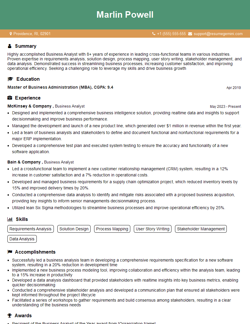
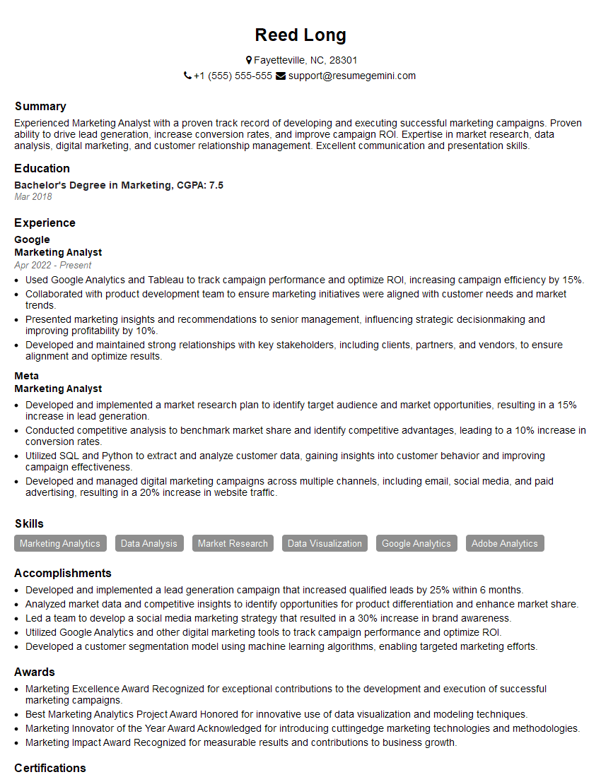
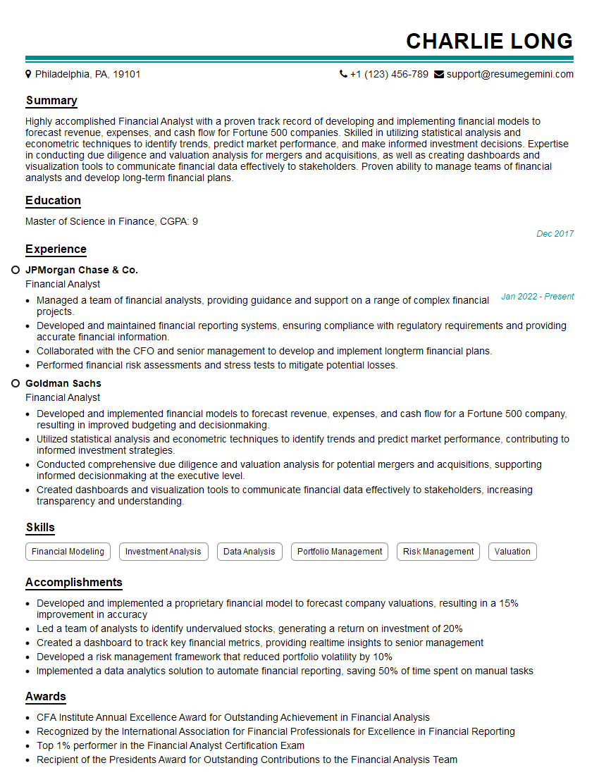
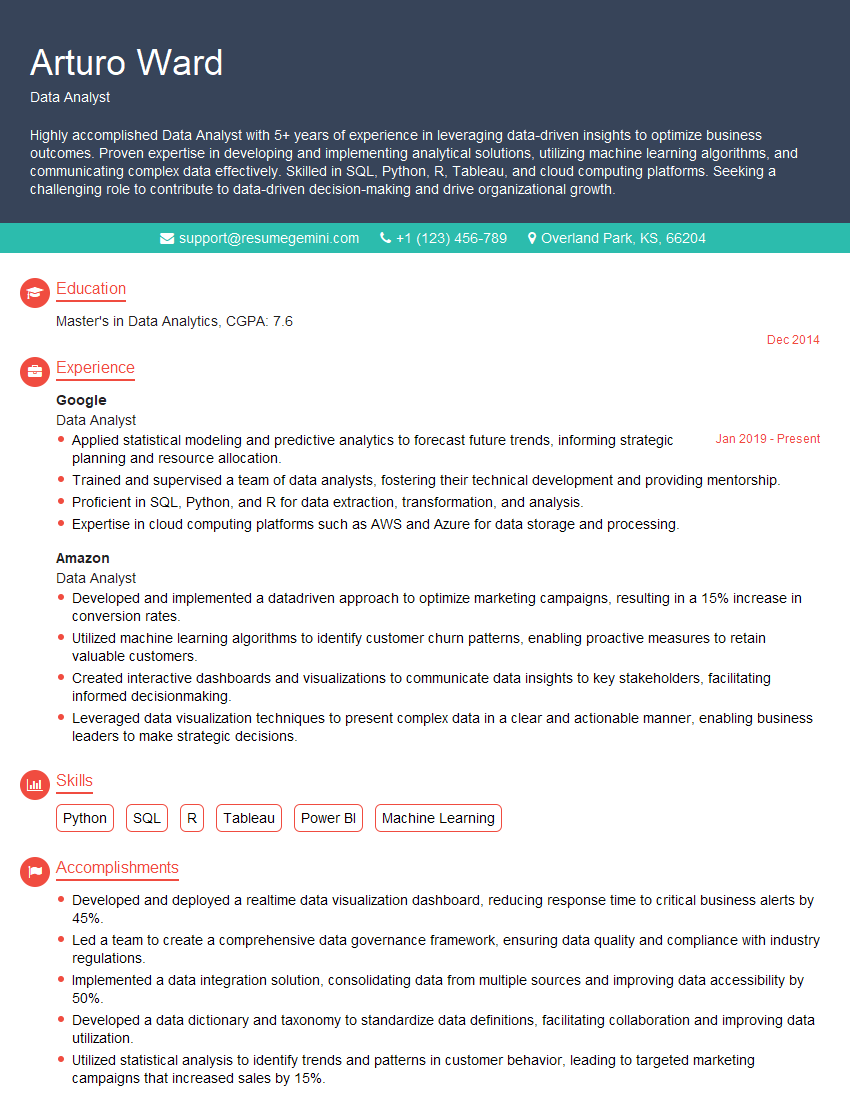
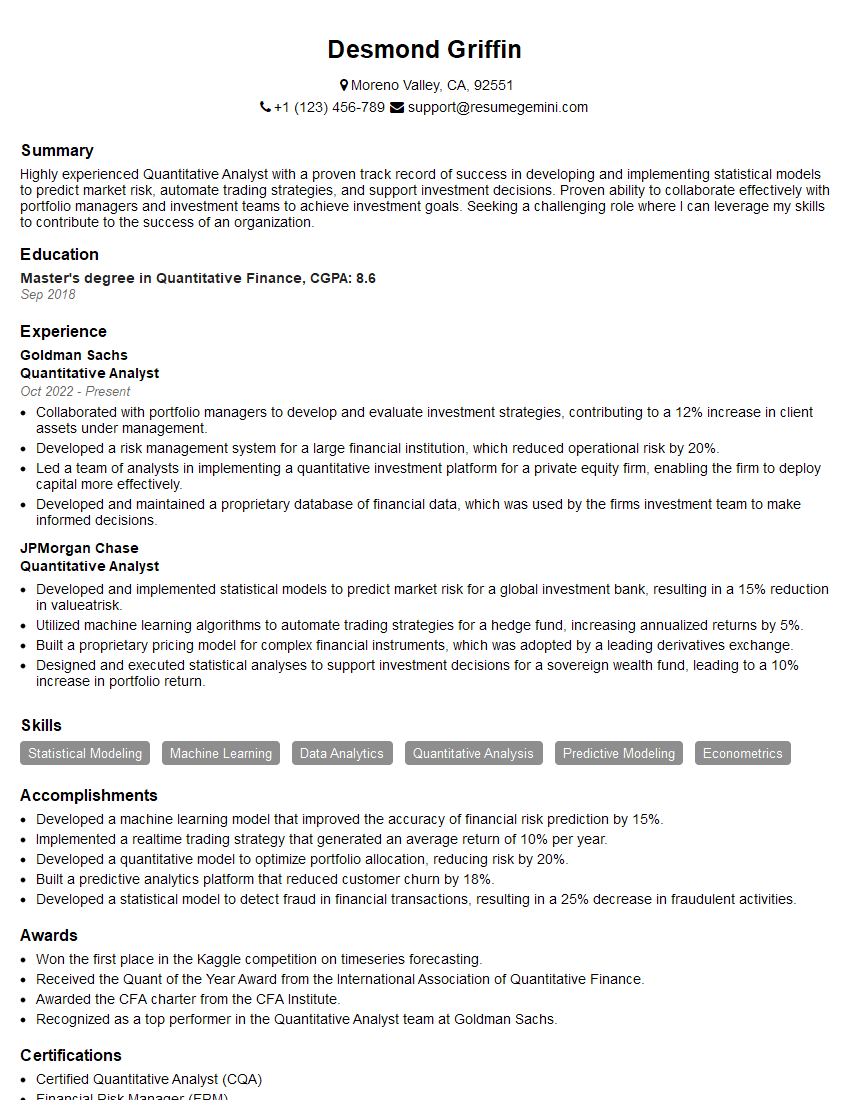
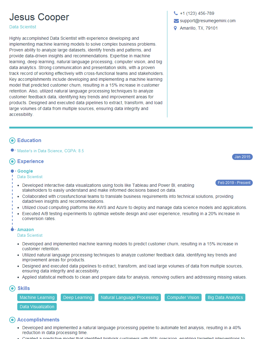
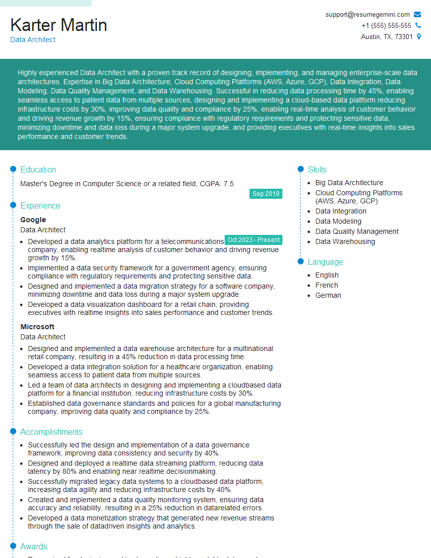
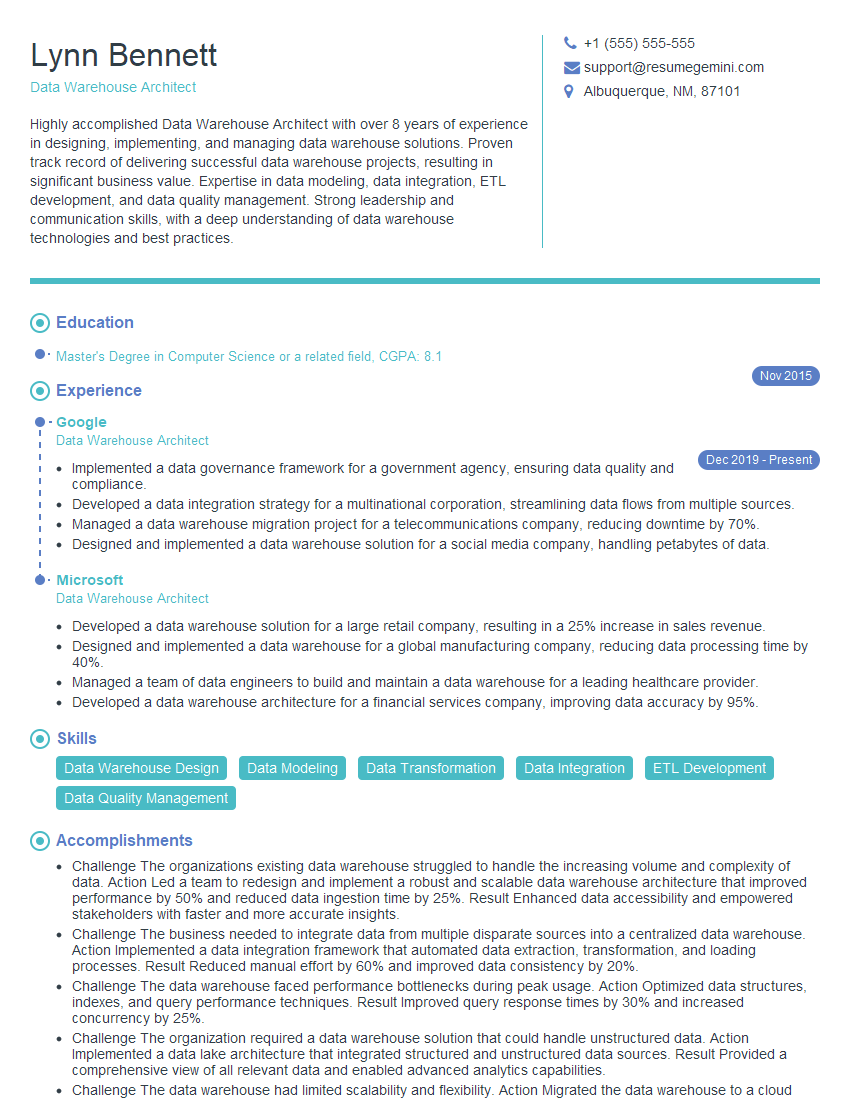
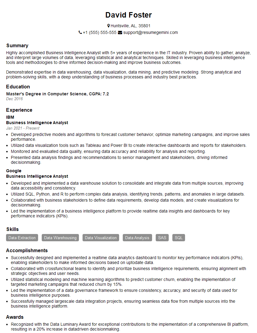
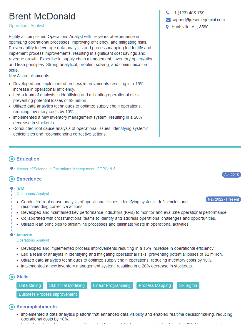
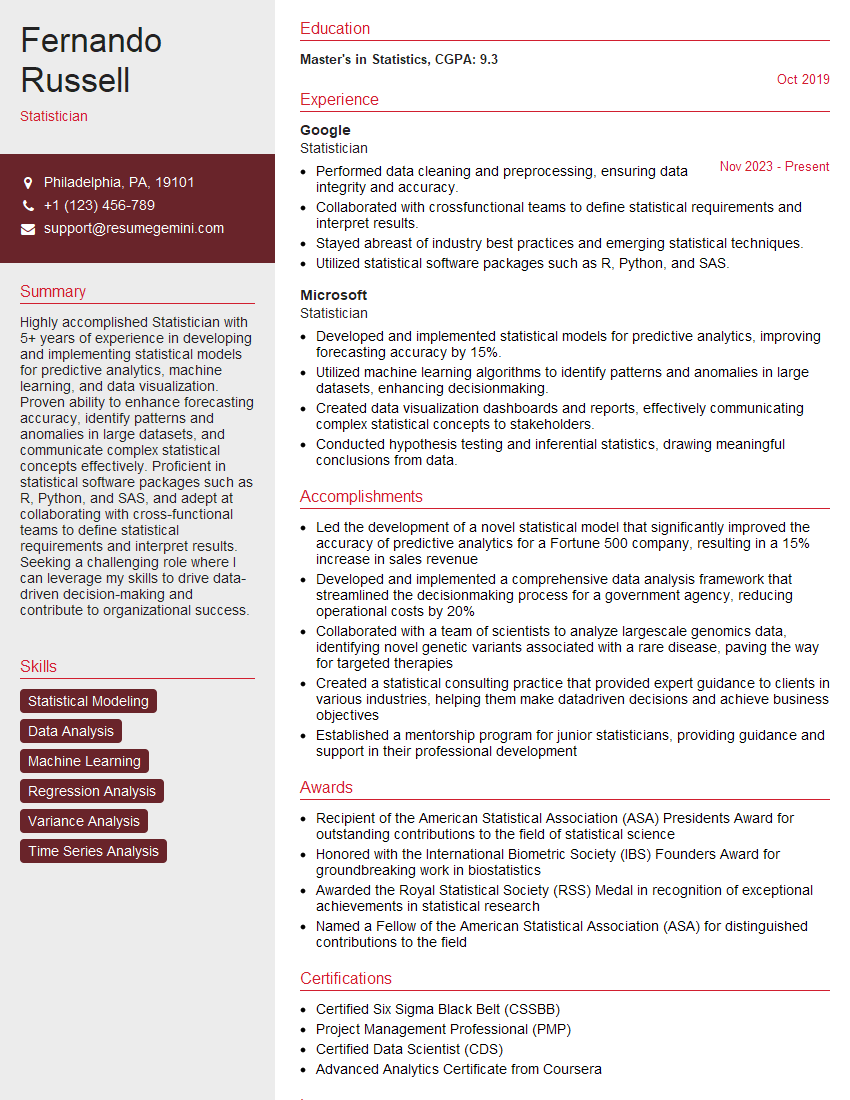
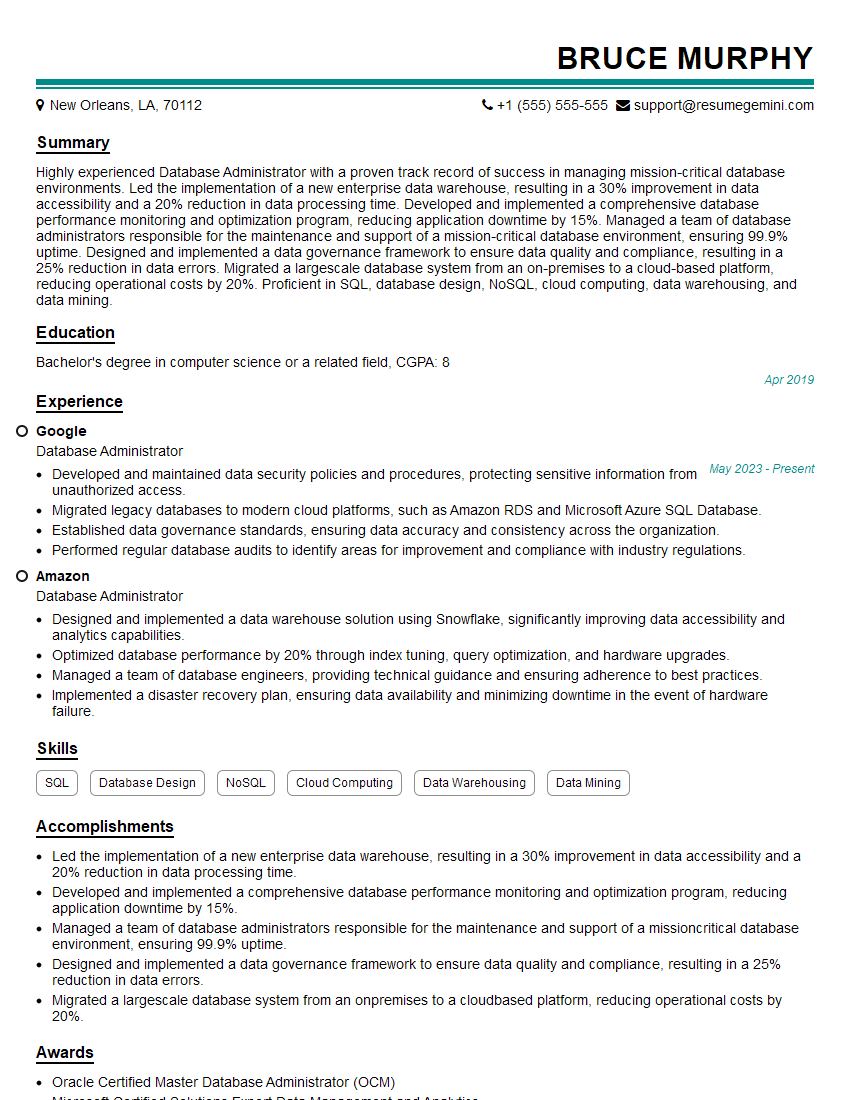
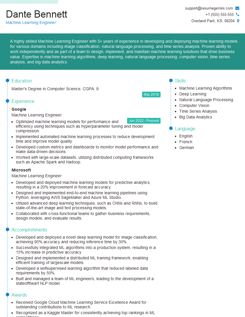
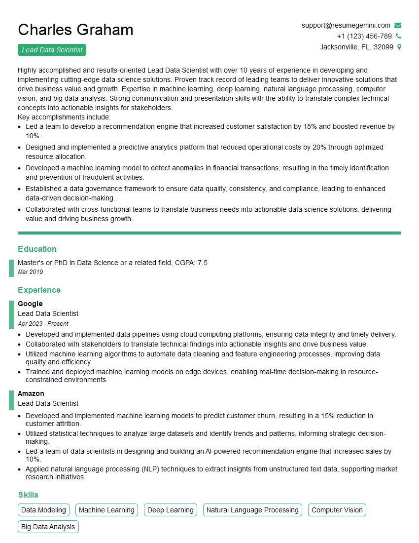
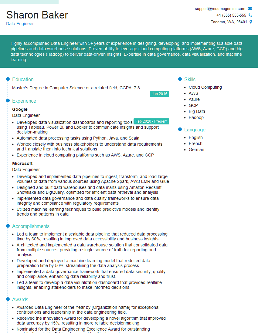
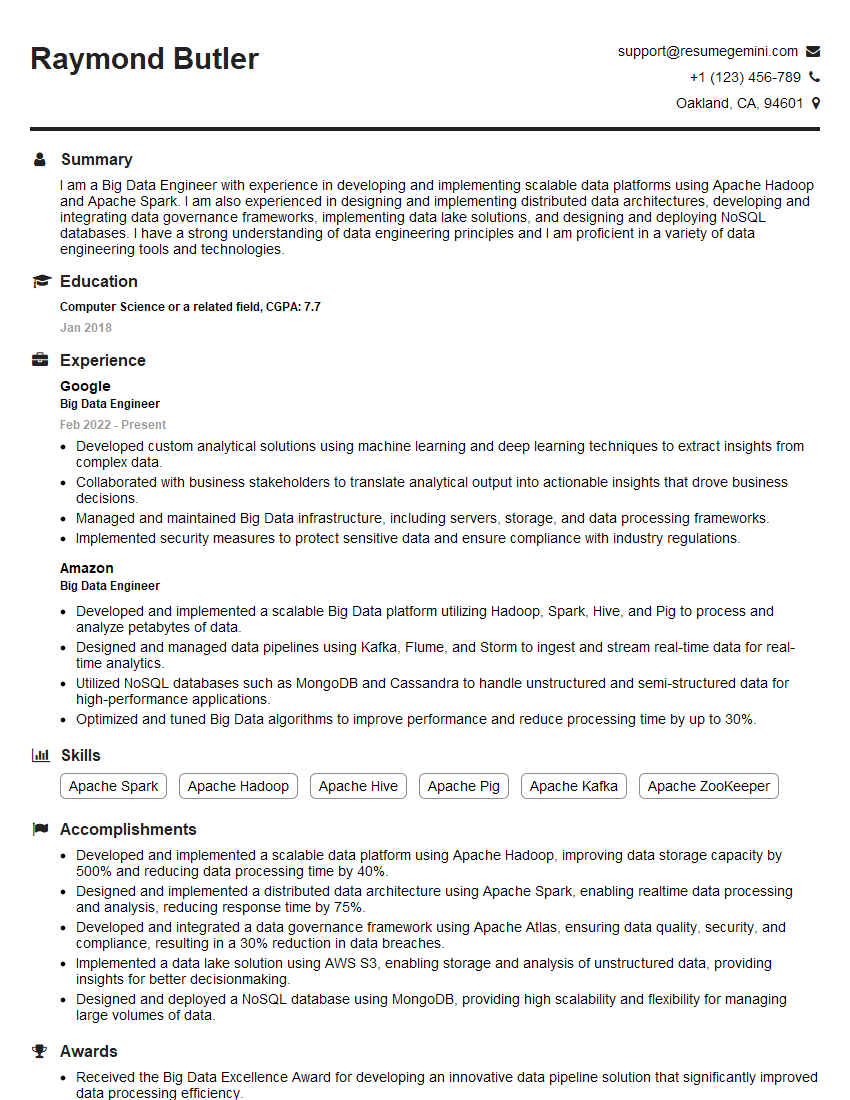
Mastering DataDriven Insights is crucial for career advancement in today’s data-centric world. A strong understanding of these concepts will significantly enhance your job prospects and open doors to exciting opportunities. To increase your chances of landing your dream role, create an ATS-friendly resume that effectively showcases your skills and experience. We strongly recommend using ResumeGemini, a trusted resource for building professional resumes that get noticed. Examples of resumes tailored to DataDriven Insights roles are provided below to help guide you.
Explore more articles
Users Rating of Our Blogs
Share Your Experience
We value your feedback! Please rate our content and share your thoughts (optional).
What Readers Say About Our Blog
Amazing blog
hello,
Our consultant firm based in the USA and our client are interested in your products.
Could you provide your company brochure and respond from your official email id (if different from the current in use), so i can send you the client’s requirement.
Payment before production.
I await your answer.
Regards,
MrSmith
These apartments are so amazing, posting them online would break the algorithm.
https://bit.ly/Lovely2BedsApartmentHudsonYards
Reach out at [email protected] and let’s get started!
Take a look at this stunning 2-bedroom apartment perfectly situated NYC’s coveted Hudson Yards!
https://bit.ly/Lovely2BedsApartmentHudsonYards
Live Rent Free!
https://bit.ly/LiveRentFREE
Interesting Article, I liked the depth of knowledge you’ve shared.
Helpful, thanks for sharing.
Hi, I represent a social media marketing agency and liked your blog
Hi, I represent an SEO company that specialises in getting you AI citations and higher rankings on Google. I’d like to offer you a 100% free SEO audit for your website. Would you be interested?
