Every successful interview starts with knowing what to expect. In this blog, we’ll take you through the top Data Presentation and Analysis interview questions, breaking them down with expert tips to help you deliver impactful answers. Step into your next interview fully prepared and ready to succeed.
Questions Asked in Data Presentation and Analysis Interview
Q 1. Explain the difference between descriptive, predictive, and prescriptive analytics.
The three types of analytics – descriptive, predictive, and prescriptive – represent a progression in how we use data. Think of them as stages in a detective story.
- Descriptive Analytics: This is the ‘what happened’ stage. It involves summarizing past data to understand trends and patterns. Imagine reviewing sales figures for the last year to see which products sold best. Tools like dashboards and summary statistics are used here. Example: Calculating the average monthly website traffic.
- Predictive Analytics: This is the ‘what might happen’ stage. It uses historical data and statistical modeling to forecast future outcomes. Like predicting future sales based on past trends and market conditions. Techniques include regression analysis and machine learning. Example: Forecasting next quarter’s sales based on seasonal trends and marketing campaigns.
- Prescriptive Analytics: This is the ‘what should we do’ stage. It goes beyond prediction to recommend actions that optimize outcomes. For instance, suggesting the optimal pricing strategy to maximize profits based on predicted demand. This often uses optimization algorithms and simulation. Example: Recommending personalized product offers based on customer behavior and predicted preferences.
Q 2. What are some common data visualization techniques and when would you use each?
Data visualization techniques are crucial for communicating insights effectively. The choice depends heavily on the data and the message you want to convey.
- Bar Charts: Ideal for comparing categories. For example, comparing sales across different regions.
- Line Charts: Show trends over time. Useful for tracking website traffic or stock prices over a period.
- Pie Charts: Represent proportions of a whole. Effective for showing market share or demographic breakdowns.
- Scatter Plots: Explore relationships between two variables. Useful for identifying correlations, for example, between advertising spend and sales.
- Histograms: Display the distribution of a single variable. Helpful for understanding data spread and identifying potential outliers.
- Heatmaps: Show data density using color gradients. Useful for visualizing large datasets, such as website click maps or correlation matrices.
- Maps: Visualize geographical data. Useful for showing sales by region or customer locations.
In practice, you might use a combination of these to tell a complete story.
Q 3. How do you choose the right chart type for a specific dataset?
Choosing the right chart type is critical for clear communication. Consider these factors:
- Type of Data: Categorical (names, labels), numerical (numbers), or temporal (time-series).
- Number of Variables: One, two, or more.
- Goal of Visualization: Compare, show trends, identify correlations, show distributions.
For instance, if you’re comparing sales across different product categories, a bar chart is a good choice. If you want to show a trend over time, a line chart is better. If you’re exploring the relationship between two numerical variables, a scatter plot is ideal.
Sometimes, a combination of charts is necessary to fully capture the complexity of the data.
Q 4. Describe your experience with data storytelling. Give an example.
Data storytelling is the art of transforming raw data into a compelling narrative that resonates with the audience. It’s about creating a story with a beginning, middle, and end, using visualizations and narrative to drive understanding.
For example, while working on a client’s marketing campaign performance, I used a series of charts to demonstrate the impact of different strategies. I started with a line graph showing overall campaign performance, then used bar charts to compare the effectiveness of individual channels (e.g., social media vs. email), and finally, a map to visualize geographic variations in customer engagement. This structured approach enabled the client to quickly grasp the key findings and make data-driven decisions for future campaigns.
Q 5. How do you handle missing data in your analysis?
Missing data is a common challenge. The best approach depends on the nature of the data, the extent of missingness, and the chosen analytical methods. Strategies include:
- Deletion: Removing rows or columns with missing data. Simple but can lead to bias if missingness is not random.
- Imputation: Replacing missing values with estimated values. Methods include mean/median imputation, regression imputation, and more sophisticated techniques like k-Nearest Neighbors.
- Model-Based Approaches: Using models that explicitly handle missing data, like multiple imputation.
The choice depends on the context. For instance, if a small percentage of data is missing randomly, deletion might be acceptable. If missingness is non-random or significant, imputation or model-based approaches are preferred. It’s crucial to document the chosen method and its potential impact on the analysis.
Q 6. How do you identify and address outliers in a dataset?
Outliers are data points that significantly deviate from the rest of the data. They can skew results and distort insights. Identification methods include:
- Visual Inspection: Using box plots, scatter plots, or histograms to identify data points that lie far from the main cluster.
- Statistical Methods: Using techniques like the Z-score or Interquartile Range (IQR) to identify data points that exceed a certain threshold.
Addressing outliers depends on the context. Options include:
- Removal: Removing the outliers from the dataset, but only if there is a clear justification (e.g., data entry error).
- Transformation: Applying transformations like log transformation to reduce the impact of outliers.
- Winsorizing/Trimming: Replacing outliers with less extreme values.
- Robust Statistical Methods: Using statistical methods that are less sensitive to outliers, such as median instead of mean.
It’s crucial to investigate the cause of outliers before deciding how to handle them.
Q 7. Explain the concept of data normalization and its importance.
Data normalization is the process of scaling and transforming data to a common range. It’s important for several reasons:
- Improved Model Performance: Many machine learning algorithms are sensitive to feature scaling. Normalization ensures that features with larger values don’t disproportionately influence the model.
- Fairer Comparisons: When features have different scales (e.g., income in dollars vs. age in years), normalization allows for fair comparisons and prevents bias.
- Faster Convergence: Some optimization algorithms converge faster when data is normalized.
Common normalization techniques include:
- Min-Max Scaling: Scales features to a range between 0 and 1.
- Z-score Standardization: Centers features around a mean of 0 and a standard deviation of 1.
The choice of normalization method depends on the specific dataset and the algorithm used. For example, min-max scaling is suitable when preserving the relative magnitude of values is important, while z-score standardization is preferred when the distribution of the features is close to normal.
Q 8. What are some common data quality issues and how do you address them?
Data quality issues are like hidden cracks in a foundation – they can undermine the entire analysis. Common problems include incompleteness (missing values), inconsistency (different formats for the same data), inaccuracy (wrong or outdated information), duplication (repeated entries), and invalidity (data that doesn’t conform to defined rules).
Addressing these issues requires a multi-pronged approach. For incompleteness, I’d explore imputation techniques – replacing missing values with reasonable estimates based on other data points. This could involve using the mean, median, or more sophisticated methods like K-Nearest Neighbors. For inconsistency, I’d standardize data formats through cleaning and transformation processes, possibly using scripting languages like Python with libraries like Pandas. Inaccuracy often requires investigating the source of the error and correcting it if possible; sometimes, flagging inaccurate data for further review is the best option. Duplication can be tackled using deduplication techniques, often involving identifying and removing identical or near-identical records. Finally, invalidity often requires validation rules – ensuring that the data meets pre-defined criteria before being included in the analysis. For example, enforcing data type restrictions or checking for ranges. The process is iterative, involving checks and re-checks to ensure data integrity.
Q 9. What experience do you have with SQL or other database query languages?
I have extensive experience with SQL, having used it for over seven years in various projects. My skills encompass writing complex queries for data extraction, transformation, and loading (ETL) processes, optimizing query performance using indexing and other techniques, and working with various database management systems (DBMS) such as PostgreSQL, MySQL, and SQL Server. For example, in a recent project, I used SQL to efficiently join data from multiple tables containing customer demographics, purchase history, and website activity to identify high-value customers. I’m also proficient in other query languages like NoSQL databases such as MongoDB, which I utilized to analyze unstructured data in a different project, creating an efficient search functionality within a large document dataset.
SELECT COUNT(*) FROM customers WHERE country = 'USA';This simple query counts the number of customers from the USA. In more complex scenarios I would use JOIN statements, subqueries, and window functions for sophisticated data manipulation.
Q 10. Describe your experience with data visualization tools (e.g., Tableau, Power BI).
I’m highly proficient in Tableau and Power BI, using them regularly to create interactive dashboards and visualizations. In Tableau, I’ve mastered techniques like creating custom calculated fields, using different chart types effectively based on the data and intended audience, and integrating data from various sources. For example, I recently built a Tableau dashboard to track real-time sales performance across different regions, allowing stakeholders to quickly identify trends and potential issues. In Power BI, I’ve leveraged its strong DAX (Data Analysis Expressions) capabilities to perform complex calculations and create insightful reports. I’ve built interactive dashboards for visualizing financial data, showing key performance indicators (KPIs) in a clear and concise manner. I also have experience with other visualization tools such as Python libraries like Matplotlib and Seaborn for creating custom visualizations and integrating them into automated reporting processes.
Q 11. How do you ensure your data visualizations are accessible to a wide audience?
Accessibility is paramount in data visualization. I ensure accessibility by following established guidelines like WCAG (Web Content Accessibility Guidelines). This involves using clear and concise labels, providing alternative text for images, ensuring sufficient color contrast for readability, and offering interactive elements with keyboard navigation. For example, I avoid using color alone to convey information, instead using patterns or labels to reinforce the message. I also ensure that charts and graphs are easy to interpret, even for people with visual impairments. Consideration is given to the size of text and the use of clear, simple fonts, choosing chart types that are naturally easy to read and understand. Finally, creating visualizations in formats that screen readers can access is essential for complete accessibility.
Q 12. How do you communicate complex data insights to non-technical stakeholders?
Communicating complex insights to non-technical stakeholders requires translating technical jargon into plain language. I use storytelling techniques to make data come alive – I don’t just present numbers, but narrate a story using charts and graphs as illustrations. I start by understanding their level of knowledge and tailoring my communication accordingly. Instead of focusing on technical details, I highlight key findings and their implications using simple, relatable analogies. For instance, instead of saying “the regression model showed a p-value of 0.02,” I might say “our analysis strongly suggests a relationship between X and Y.” I also use visual aids extensively – well-designed dashboards and presentations are crucial for conveying complex information effectively. Interactive elements also greatly help engage the audience and allow them to explore the data at their own pace.
Q 13. Explain your process for creating a dashboard or report.
My process for creating a dashboard or report is iterative and involves several key steps: 1. Understanding the requirements: Defining the purpose, target audience, and key performance indicators (KPIs). 2. Data gathering and preparation: Collecting data from various sources, cleaning and transforming it to ensure quality and consistency. 3. Data analysis: Exploring the data to identify trends and patterns, using appropriate statistical methods if needed. 4. Visualization design: Choosing the right charts and graphs to effectively communicate the findings, considering accessibility and audience understanding. 5. Dashboard/report development: Building the dashboard or report using chosen tools (Tableau, Power BI, etc.), ensuring interactivity and user-friendliness. 6. Testing and iteration: Reviewing the dashboard/report with stakeholders, making adjustments based on feedback, and refining the design until it meets the requirements. 7. Deployment and maintenance: Making the dashboard/report accessible to the intended audience and monitoring its effectiveness over time, making updates as needed.
Q 14. How do you measure the effectiveness of your data presentations?
Measuring the effectiveness of data presentations is crucial. I use several metrics: 1. Engagement: Tracking the number of views, downloads, or interactions with the dashboard/report. 2. Actionability: Monitoring whether the presentation led to informed decisions or actions. For example, did it result in changes to strategy or improved business outcomes? 3. Feedback: Collecting feedback from stakeholders through surveys, interviews, or informal discussions to assess clarity, usefulness, and impact. 4. Data-driven decision making: Observing whether the presentation influenced the decision-making process and the resulting outcomes. 5. Goal attainment: Measuring whether the dashboard/report helped achieve its intended goals (e.g., improving sales, reducing costs). Using a combination of quantitative and qualitative metrics ensures a well-rounded assessment of presentation effectiveness.
Q 15. Describe your experience with A/B testing or other experimental design methods.
A/B testing, also known as split testing, is a crucial experimental design method used to compare two versions of something (e.g., a webpage, email subject line, advertisement) to determine which performs better. It’s a randomized controlled experiment where users are randomly assigned to either the control group (seeing the original version) or the treatment group (seeing the new version). We then measure a key metric (conversion rate, click-through rate, etc.) to see if there’s a statistically significant difference.
In my experience, I’ve extensively used A/B testing in website optimization projects. For example, I once worked on optimizing the checkout process of an e-commerce site. We A/B tested two different versions: one with a simplified checkout form and another with the original, more complex one. By using statistical analysis (like t-tests), we discovered the simplified version significantly increased the conversion rate by 15%, leading to a considerable boost in sales. This illustrates the power of well-designed experiments and data-driven decision-making.
Beyond A/B testing, I’m familiar with other experimental designs such as multivariate testing (comparing multiple variations of multiple elements simultaneously) and factorial designs (systematically testing the effects of multiple independent variables).
Career Expert Tips:
- Ace those interviews! Prepare effectively by reviewing the Top 50 Most Common Interview Questions on ResumeGemini.
- Navigate your job search with confidence! Explore a wide range of Career Tips on ResumeGemini. Learn about common challenges and recommendations to overcome them.
- Craft the perfect resume! Master the Art of Resume Writing with ResumeGemini’s guide. Showcase your unique qualifications and achievements effectively.
- Don’t miss out on holiday savings! Build your dream resume with ResumeGemini’s ATS optimized templates.
Q 16. How do you handle conflicting data from different sources?
Conflicting data from different sources is a common challenge. My approach involves a systematic investigation to identify the root cause of the discrepancy. I start by meticulously examining the data sources, understanding their methodologies, and evaluating data quality. This often includes checking for data entry errors, inconsistencies in definitions, or biases in data collection.
For example, if sales figures from our internal system differ from those reported by our external CRM, I would first verify the time periods being compared, check for any discrepancies in customer IDs or product codes, and investigate potential delays in data synchronization. If the discrepancies persist, I’d explore potential reasons such as differences in reporting methodologies, data lags, or even data corruption.
Once the source of the conflict is identified, I employ appropriate data reconciliation techniques. This may involve cleaning or correcting the data, using data imputation methods for missing values (if appropriate), or weighting the data from different sources based on their reliability. Sometimes, it’s necessary to discard unreliable data sources if they cannot be reconciled effectively.
Q 17. What statistical methods are you familiar with and how have you used them?
I’m proficient in a range of statistical methods relevant to data analysis and presentation. These include:
- Descriptive Statistics: Calculating measures of central tendency (mean, median, mode), dispersion (standard deviation, variance), and creating visualizations like histograms and box plots to summarize data.
- Inferential Statistics: Employing hypothesis testing (t-tests, ANOVA, chi-square tests) to draw conclusions about a population based on sample data. I use regression analysis (linear, logistic) to model relationships between variables and make predictions.
- Time Series Analysis: Applying techniques like ARIMA modeling to forecast future trends based on historical data. This is crucial in areas like sales forecasting and financial modeling.
For instance, in a recent project, I used regression analysis to model the relationship between advertising spend and sales revenue. This allowed us to optimize our marketing budget and predict future sales more accurately. Another example involved using a chi-square test to determine if there was a significant association between customer demographics and product preferences.
Q 18. How do you stay up-to-date with the latest trends in data presentation and analysis?
Staying current in data presentation and analysis requires a multifaceted approach. I actively engage in the following:
- Reading industry publications and blogs: I regularly read publications like Towards Data Science, Analytics Vidhya, and journals focusing on data science and visualization.
- Attending conferences and webinars: Participating in industry events provides exposure to the latest tools, techniques, and best practices.
- Following key influencers and researchers on social media: This allows me to stay informed about breakthroughs and emerging trends in the field.
- Taking online courses and workshops: Continuous learning is critical to expand my skillset and knowledge base; platforms like Coursera and edX provide valuable resources.
- Experimenting with new tools and technologies: Hands-on experience with new tools and technologies is essential to assess their value and effectiveness.
Q 19. Describe a time you had to present complex data to a skeptical audience.
I once had to present a complex financial analysis to a group of executives who were skeptical about the data’s implications. The analysis showed that a significant cost-cutting measure would actually lead to a decrease in long-term profitability. This was counterintuitive, and the executives were hesitant to accept the findings.
My approach was to focus on clear and concise communication. I started by explaining the methodology used, highlighting the data’s reliability and the robustness of the analysis. I used simple, easy-to-understand visuals – charts and graphs – to illustrate the key findings and avoided technical jargon. I also anticipated their skepticism and addressed potential counterarguments proactively, providing evidence to refute their concerns. Instead of simply presenting the data, I emphasized the narrative and the business implications, making it relatable to their strategic goals.
This approach helped build trust and ultimately persuaded the executives to adopt a more nuanced approach to cost reduction, ultimately saving the company from a potentially damaging decision. This emphasized the importance of not only sound data analysis but also effective communication and relationship building.
Q 20. How do you prioritize different data analysis tasks?
Prioritizing data analysis tasks involves a strategic approach that balances urgency, impact, and feasibility. I typically use a framework that considers the following factors:
- Business Impact: Tasks directly impacting key business decisions or objectives are prioritized higher.
- Urgency: Time-sensitive analyses needed for immediate action take precedence.
- Feasibility: Tasks with readily available data and requiring less time are prioritized over those requiring extensive data gathering or complex modeling.
- Dependencies: Tasks that are prerequisites for other analyses are handled first.
I often employ a Kanban board or a similar visual management tool to track the progress of various tasks and ensure that the most critical ones are addressed promptly. This provides transparency and allows for easy adjustment based on evolving business needs.
Q 21. What is your preferred method for data cleaning and preprocessing?
My preferred method for data cleaning and preprocessing involves a multi-step process that starts with understanding the data’s context and characteristics. I utilize a combination of automated and manual techniques:
- Data Inspection and Profiling: I thoroughly examine the data to understand its structure, identify missing values, outliers, and inconsistencies. Profiling tools help automate this process.
- Handling Missing Values: I strategically handle missing values depending on the context. This may involve imputation (filling in missing values based on statistical methods) or removal of incomplete records (if appropriate).
- Outlier Detection and Treatment: Outliers are identified using various methods (box plots, scatter plots, Z-scores). I assess whether outliers are due to errors or reflect genuine extreme values and handle them accordingly. This might involve removing, transforming, or capping them.
- Data Transformation: This often includes converting data types, standardizing or normalizing variables, and creating new features based on existing ones.
- Data Validation: After cleaning, I rigorously validate the data to ensure accuracy and consistency.
Tools like Python’s Pandas library and SQL are extensively used during this process. The specific techniques I apply are always context-dependent and chosen to minimize data loss while maintaining data integrity and quality.
Q 22. What are the ethical considerations when presenting and analyzing data?
Ethical considerations in data presentation and analysis are paramount. They ensure fairness, transparency, and responsible use of data. Misrepresenting data can have serious consequences, impacting decisions and potentially harming individuals or groups.
- Data Integrity: Ensuring data accuracy and avoiding manipulation or cherry-picking to support a pre-determined conclusion is crucial. This includes proper data cleaning, handling missing values appropriately, and being transparent about data limitations.
- Context and Transparency: Always present data within its proper context. Clearly explain the methodology, including data sources, limitations, and any assumptions made during the analysis. Avoid misleading visualizations or interpretations.
- Privacy and Confidentiality: Protecting individual privacy is essential. Anonymize data where possible, and comply with relevant privacy regulations (like GDPR or HIPAA) when handling sensitive information. Ensure informed consent when collecting and using personal data.
- Bias and Fairness: Be aware of potential biases in data collection and analysis. Consider the impact of biases on the interpretation and presentation of results. Strive for fairness and equity in the representation of different groups.
- Objectivity: Avoid letting personal beliefs or external pressures influence the analysis or presentation of findings. Present results objectively and transparently, allowing the data to speak for itself.
For instance, imagine analyzing crime statistics. Presenting only crime rates in a specific neighborhood without considering socioeconomic factors could create a misleading narrative and perpetuate harmful stereotypes. Ethical data presentation requires a balanced and nuanced approach.
Q 23. Explain your experience with different types of charts (bar, line, scatter, etc.)
I have extensive experience using various chart types to communicate data effectively. The choice of chart depends heavily on the type of data and the message I want to convey.
- Bar Charts: Ideal for comparing categorical data. For example, comparing sales figures across different product categories or comparing the number of students in different schools.
- Line Charts: Best for showing trends over time. Examples include tracking website traffic over a month or visualizing stock prices over a year. They are excellent for illustrating change and growth.
- Scatter Plots: Used to explore relationships between two numerical variables. For example, plotting height versus weight to see if there’s a correlation, or plotting advertising spend against sales to examine the relationship between these two factors.
- Pie Charts: Useful for showing proportions or percentages of a whole. However, I use them cautiously as they can become cluttered with too many categories.
- Histograms: Effective for displaying the distribution of a single numerical variable, showing the frequency of data within specific ranges (bins). Useful for understanding data spread and identifying outliers.
I also have experience with more advanced chart types like heatmaps (for visualizing correlation matrices or geographical data), box plots (for comparing the distribution of multiple datasets), and treemaps (for hierarchical data representation).
Q 24. How do you determine the appropriate level of detail for a data visualization?
Determining the appropriate level of detail is crucial for effective data visualization. Too much detail can overwhelm the audience, while too little can obscure important insights. The key is to strike a balance, focusing on the information most relevant to the intended audience and the analytical objective.
My approach involves:
- Understanding the audience: Who am I presenting this data to? Their level of understanding will influence the level of detail needed. A technical audience might appreciate more granular information than a general audience.
- Defining the purpose: What story am I trying to tell with this data? The purpose of the visualization will dictate the level of detail required. If the goal is a high-level overview, less detail is necessary; if the goal is to identify specific trends, more detail might be needed.
- Iterative refinement: I often create multiple versions of the visualization with varying levels of detail and test them with stakeholders to get feedback. This iterative process helps to fine-tune the presentation until it is clear and effective.
- Using annotations and interactive elements: When appropriate, I add annotations or interactive elements (tooltips, zoom capabilities) to allow the audience to explore the data in more detail as needed, without cluttering the initial view.
For example, presenting a company’s financial performance might involve a high-level summary chart initially, with options to drill down to more detailed charts for specific revenue streams or expense categories upon request.
Q 25. How do you handle large datasets that are difficult to visualize effectively?
Handling large datasets requires strategic approaches to visualization. Directly visualizing millions of data points is impractical. Techniques I use include:
- Sampling: Creating a representative subset of the data allows for faster processing and visualization. Careful consideration must be given to ensure the sample accurately reflects the characteristics of the entire dataset.
- Aggregation and Summarization: Grouping data into meaningful categories and calculating summary statistics (e.g., averages, medians, percentiles) reduces the volume of data while retaining important information. Histograms, box plots, and summary tables are useful tools here.
- Interactive visualizations: Tools that allow for exploration and filtering of the data, such as those found in Tableau or Power BI, enable the audience to interact with the data and explore different subsets at their own pace. This avoids overwhelming them with the full dataset at once.
- Data reduction techniques: Methods like dimensionality reduction (PCA, t-SNE) can reduce the number of variables while retaining the most important information, simplifying visualization.
- Parallel Coordinates Plots: These plots are especially useful for visualizing high-dimensional data by displaying each data point as a line across multiple axes, one for each variable.
Imagine analyzing millions of customer transactions. Instead of showing each individual transaction, I might aggregate the data by customer segment, product category, and time period, presenting summary statistics and trends using bar charts and line graphs.
Q 26. What is your experience with different data manipulation tools (e.g., Python, R)?
I am proficient in both Python and R for data manipulation and analysis. Each language has strengths depending on the task.
- Python (with libraries like Pandas, NumPy, and Scikit-learn): I utilize Python for its versatility and extensive libraries. Pandas provides powerful data manipulation capabilities, NumPy offers efficient numerical computation, and Scikit-learn provides a wide array of machine learning tools. Python’s readability and ease of integration with other tools make it ideal for many projects.
- R (with libraries like dplyr, tidyr, and ggplot2): R excels in statistical computing and data visualization. Libraries like dplyr and tidyr streamline data manipulation, while ggplot2 allows for creating elegant and informative visualizations. R’s strength lies in its statistical capabilities and its rich ecosystem of specialized packages.
#Example Python code using Pandas: import pandas as pd data = pd.read_csv('data.csv') data['new_column'] = data['column1'] + data['column2'] print(data.head())
I select the most appropriate tool based on the project requirements, considering factors such as existing infrastructure, team expertise, and the specific analytical techniques needed.
Q 27. Describe a time you identified an unexpected insight from data analysis.
In a project analyzing customer churn for a telecommunications company, I discovered an unexpected correlation between customer churn and the number of customer service calls related to billing issues. While high call volumes were expected to correlate with churn, the magnitude of the effect surprised me. It was far greater than the impact of other factors like network outages.
Initially, the focus was on network performance and service quality. But, my analysis revealed that a significant portion of the churn was directly attributable to billing-related frustrations. This insight led to a change in strategy. The company invested heavily in improving its billing system and customer service training, resulting in a measurable reduction in churn rates and an improvement in customer satisfaction.
This experience highlights the importance of thorough exploratory data analysis and the ability to identify unexpected patterns and relationships. It demonstrated how data-driven insights can lead to actionable strategies and significant business improvements.
Q 28. How do you balance the need for accuracy with the need for clear and concise communication?
Balancing accuracy and clear communication is a constant challenge in data presentation. It requires careful consideration of the audience and the goal of the presentation.
My approach involves:
- Prioritizing key findings: Focus on the most important insights from the data, avoiding overwhelming the audience with unnecessary details. This ensures the key messages are communicated clearly and effectively.
- Using appropriate visualizations: Choose visualizations that best represent the data without distorting it. Avoid misleading charts or graphs that could misrepresent the findings.
- Simplifying complex concepts: Use clear and concise language, avoiding technical jargon whenever possible. If technical terms are necessary, provide clear definitions.
- Transparency and context: Always be upfront about any limitations or uncertainties in the data. Provide context to help the audience understand the implications of the findings.
- Iterative feedback: Share drafts of presentations with stakeholders and solicit feedback to ensure clarity and accuracy. This iterative process helps to refine the presentation and ensure it effectively communicates the key messages.
Think of it like baking a cake. Accuracy is like using the precise recipe and ingredients. Clear communication is like presenting the perfectly baked cake attractively, making it appealing and easy to enjoy. The goal is to deliver both the accurate results and a compelling story that resonates with the audience.
Key Topics to Learn for Data Presentation and Analysis Interview
- Data Visualization Techniques: Understanding various chart types (bar charts, line graphs, scatter plots, heatmaps, etc.) and choosing the most effective visualization for different datasets and audiences. Practical application: Analyzing A/B testing results and presenting findings to stakeholders using appropriate visuals.
- Statistical Analysis: Proficiency in descriptive statistics (mean, median, mode, standard deviation), inferential statistics (hypothesis testing, confidence intervals), and regression analysis. Practical application: Identifying trends and correlations in sales data to inform marketing strategies.
- Data Storytelling: Communicating insights effectively through clear, concise, and engaging narratives. This includes structuring presentations logically, highlighting key findings, and supporting claims with evidence. Practical application: Presenting complex financial data to non-technical executives in a way they can easily understand.
- Data Cleaning and Preprocessing: Handling missing values, outliers, and inconsistent data formats. Practical application: Preparing a messy dataset for analysis using tools like Python’s Pandas library.
- Data Wrangling & Transformation: Techniques for cleaning, structuring, and transforming raw data into a format suitable for analysis and presentation. Practical application: Combining data from multiple sources to create a comprehensive view of customer behavior.
- Dashboarding and Reporting: Building interactive dashboards and generating reports to track key performance indicators (KPIs) and monitor progress. Practical application: Creating a dashboard to monitor website traffic and user engagement.
- Choosing the Right Tools: Familiarity with data analysis software (e.g., Excel, Tableau, Power BI, R, Python) and understanding their strengths and weaknesses. Practical application: Selecting the appropriate tool based on project requirements and personal expertise.
Next Steps
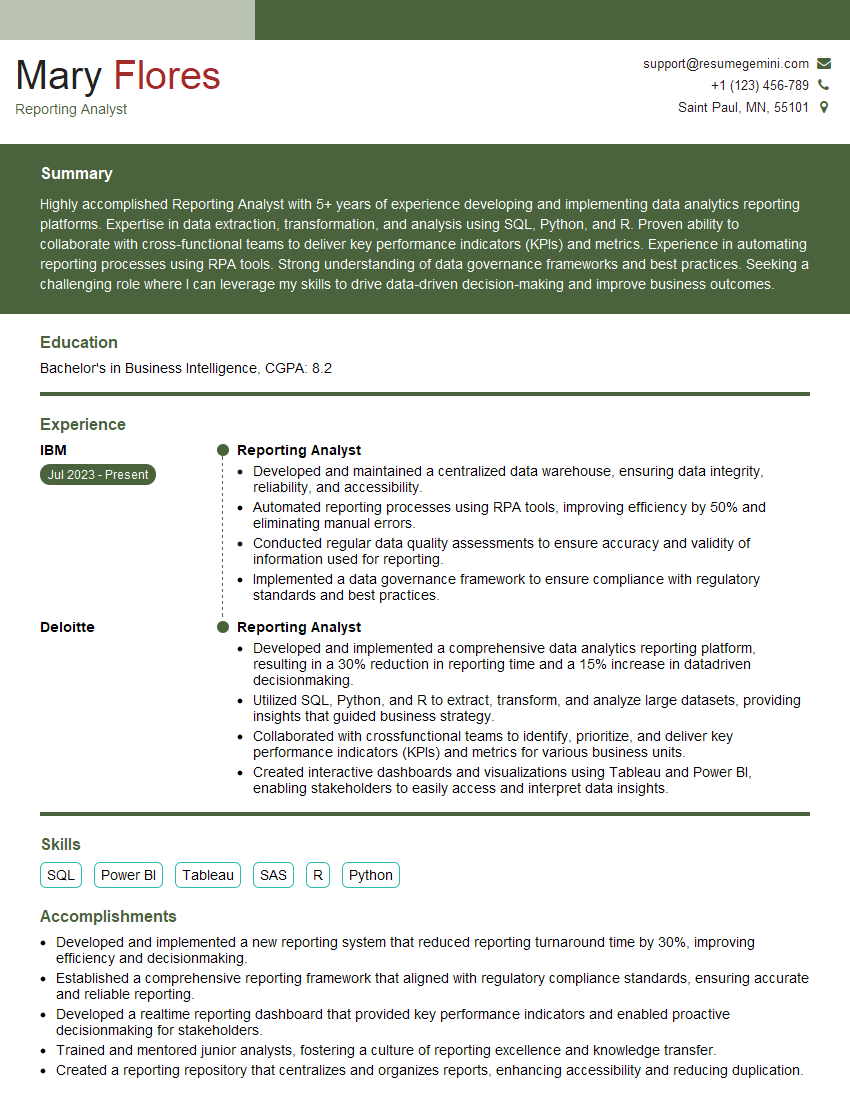
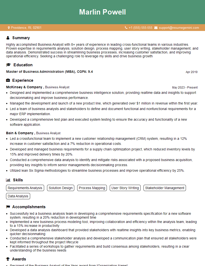
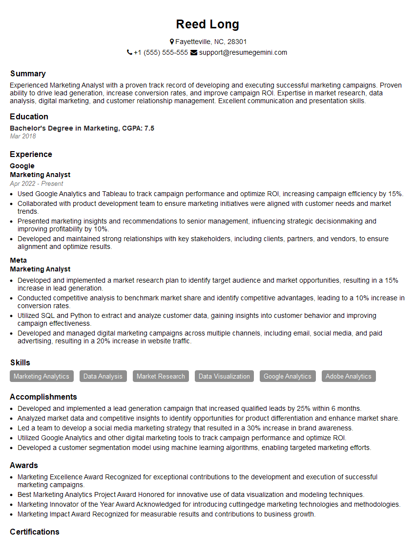
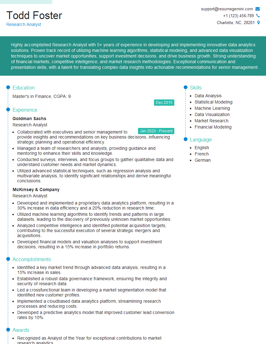
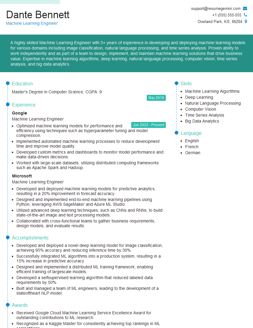
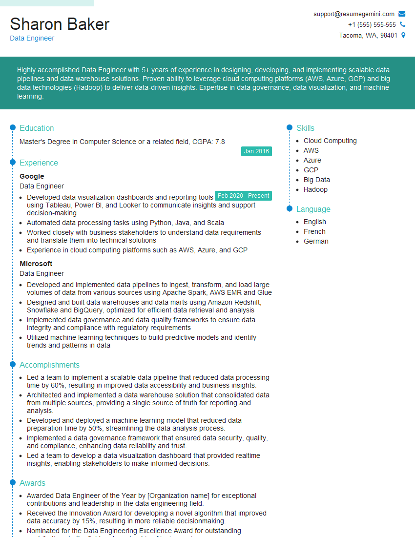
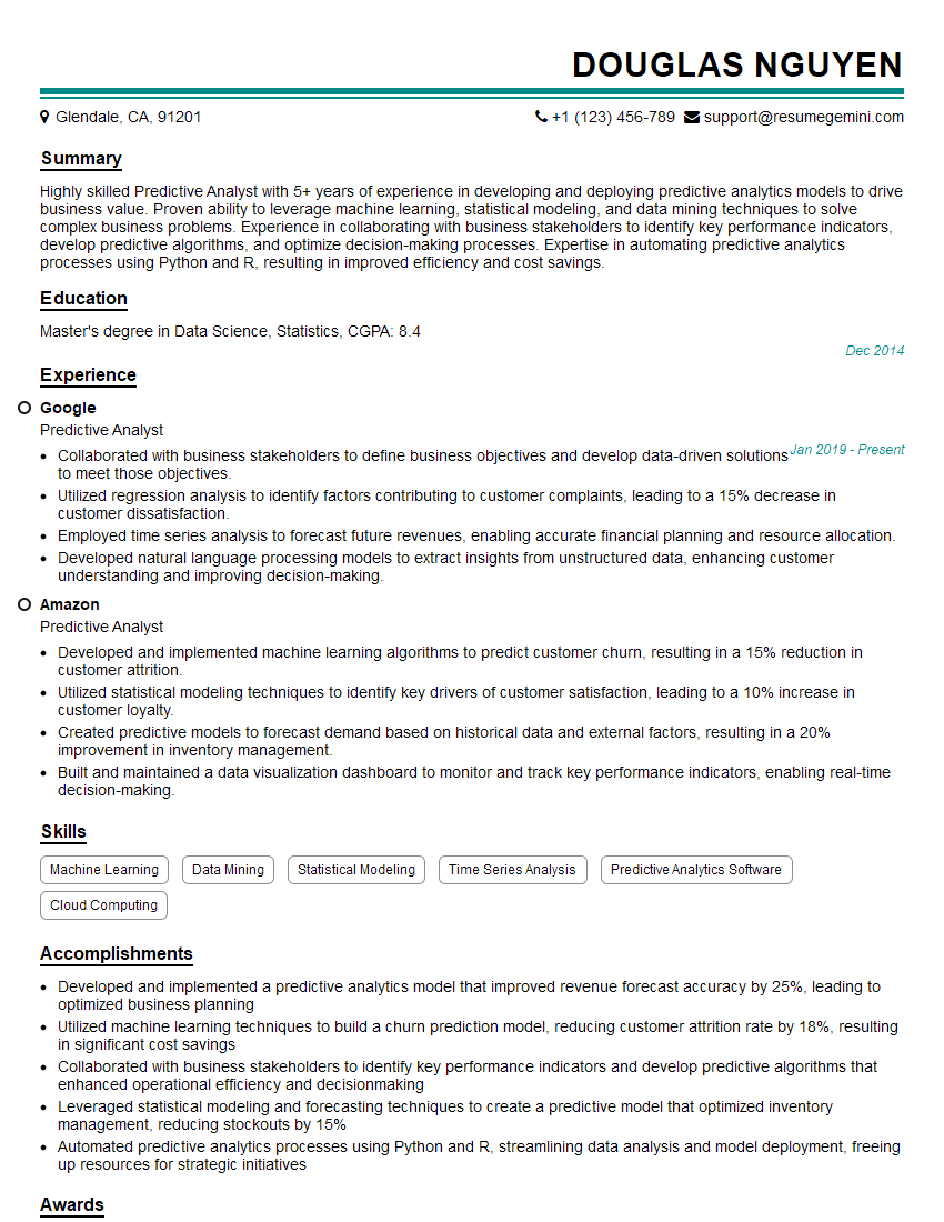
Mastering Data Presentation and Analysis is crucial for career advancement in today’s data-driven world. It allows you to extract valuable insights, communicate effectively, and drive informed decision-making. To maximize your job prospects, focus on crafting an ATS-friendly resume that highlights your skills and experience. ResumeGemini is a trusted resource for building professional resumes, and we provide examples tailored specifically to Data Presentation and Analysis roles to help you showcase your abilities effectively. Take advantage of these resources to create a resume that truly represents your potential.
Explore more articles
Users Rating of Our Blogs
Share Your Experience
We value your feedback! Please rate our content and share your thoughts (optional).
What Readers Say About Our Blog
Hi, I’m Jay, we have a few potential clients that are interested in your services, thought you might be a good fit. I’d love to talk about the details, when do you have time to talk?
Best,
Jay
Founder | CEO
Hi, I represent an SEO company that specialises in getting you AI citations and higher rankings on Google. I’d like to offer you a 100% free SEO audit for your website. Would you be interested?
Hi, I represent an SEO company that specialises in getting you AI citations and higher rankings on Google. I’d like to offer you a 100% free SEO audit for your website. Would you be interested?
Dear Sir/Madam,
Do you want to become a vendor/supplier/service provider of Delta Air Lines, Inc.? We are looking for a reliable, innovative and fair partner for 2025/2026 series tender projects, tasks and contracts. Kindly indicate your interest by requesting a pre-qualification questionnaire. With this information, we will analyze whether you meet the minimum requirements to collaborate with us.
Best regards,
Carey Richardson
V.P. – Corporate Audit and Enterprise Risk Management
Delta Air Lines Inc
Group Procurement & Contracts Center
1030 Delta Boulevard,
Atlanta, GA 30354-1989
United States
+1(470) 982-2456
