The thought of an interview can be nerve-wracking, but the right preparation can make all the difference. Explore this comprehensive guide to Web Design Principles interview questions and gain the confidence you need to showcase your abilities and secure the role.
Questions Asked in Web Design Principles Interview
Q 1. Explain the difference between UI and UX design.
UI (User Interface) design focuses on the look and feel of a product, while UX (User Experience) design focuses on the overall experience a user has with that product. Think of it like this: UI is the makeup, and UX is the personality.
UI design is about the visual elements – buttons, colors, typography, layout – that make a product visually appealing and easy to navigate. UX design is broader; it considers the user’s journey, from initial interaction to achieving their goal. It involves research, wireframing, prototyping, and testing to ensure the product is usable, enjoyable, and effective.
Example: A beautifully designed login screen (UI) that is difficult to use or doesn’t securely store data (poor UX) is a failure. Conversely, a login screen that functions flawlessly but is visually bland (good UX, weak UI) might still be effective, but could lose users who prefer a more aesthetically pleasing experience. The best products excel in both UI and UX.
Q 2. Describe your process for designing a responsive website.
Designing a responsive website is crucial for ensuring a seamless experience across various devices. My process typically involves these steps:
- Understanding the Target Audience and Device Landscape: I start by identifying the key demographics using the website and the types of devices they’ll use (desktops, tablets, smartphones).
- Content Prioritization and Structure: I determine which content is most important and organize it hierarchically for optimal presentation on different screen sizes. Less critical information might be hidden behind menus or accordions on smaller screens.
- Wireframing and Prototyping: I create wireframes to map out the layout and functionality on different screen sizes, then build interactive prototypes to test the user flow and identify potential issues.
- Responsive Design Implementation: I use techniques like fluid grids, flexible images, and media queries (CSS) to create layouts that adapt smoothly to varying screen widths and resolutions.
- Testing and Iteration: Thorough testing across different browsers and devices is essential to ensure responsiveness and identify any layout or functionality problems.
Example using Media Queries:
@media (max-width: 768px) {
  .column {
    width: 100%;
  }
}
This CSS code snippet shows how a column element’s width changes based on the screen size. On screens wider than 768px, the column might occupy a specific percentage of the width. But on screens smaller than 768px, it will expand to occupy the full width, making the layout responsive.
Q 3. What are the key principles of Gestalt design?
Gestalt principles are rules of human perception that explain how we visually organize elements into groups and patterns. Understanding these principles is key to creating visually appealing and intuitive designs.
- Proximity: Elements placed close together are perceived as a group.
- Similarity: Similar elements (color, shape, size) are perceived as related.
- Closure: We tend to complete incomplete shapes or figures.
- Continuity: Our eyes tend to follow lines or curves.
- Figure/Ground: We distinguish between a figure (object of focus) and the background.
Example: A list of items with bullet points uses proximity to group related information. Using similar font styles and colors for headings creates a visual hierarchy based on similarity. A partially hidden object, where you infer the full shape, demonstrates closure.
Q 4. How do you ensure accessibility in your web designs?
Accessibility ensures that websites are usable by people with disabilities. I incorporate accessibility best practices throughout the design process:
- Semantic HTML: Using appropriate HTML elements (
<header>,<nav>,<main>,<article>, etc.) provides structure and meaning to the content, making it easier for assistive technologies to interpret. - Alternative Text for Images: Every image needs descriptive alt text that explains its purpose and content to users who cannot see it.
- Keyboard Navigation: All interactive elements must be accessible via keyboard navigation, crucial for users who cannot use a mouse.
- Color Contrast: Sufficient contrast between text and background colors ensures readability for users with low vision.
- Captions and Transcripts for Videos and Audio: Providing captions and transcripts makes media content accessible to deaf or hard-of-hearing users.
- ARIA Attributes: These attributes (Accessible Rich Internet Applications) enhance the accessibility of interactive elements that aren’t adequately supported by standard HTML.
Example: Instead of using an image solely for navigation, I’d use a <nav> element containing links, ensuring screen readers can properly interpret the navigation structure.
Q 5. Explain the importance of user research in the design process.
User research is the cornerstone of successful design. It provides valuable insights into users’ needs, behaviors, and expectations. This helps create a design that is not only aesthetically pleasing but also genuinely useful and enjoyable for the intended audience.
Without user research, designers risk building products that nobody wants or understands. Imagine spending months designing a website only to discover users find it confusing or frustrating because you failed to understand their needs. User research prevents these kinds of costly mistakes.
Methods of User Research: User interviews, surveys, usability testing, A/B testing, persona development, and competitive analysis all provide valuable data. The right mix of methods depends on project goals and resources.
Q 6. What are some common usability testing methods?
Usability testing involves observing users interacting with a design to identify areas for improvement. Common methods include:
- Think-Aloud Protocol: Users verbalize their thoughts and actions while using the website, providing insights into their decision-making process.
- Eye-Tracking: This technique tracks users’ eye movements to identify areas of focus and potential problems.
- A/B Testing: Comparing different design versions to determine which performs better.
- Heuristic Evaluation: Experts evaluate a design based on established usability principles.
- Remote Usability Testing: Conducting tests remotely via screen sharing and collaboration tools, offering a cost-effective solution.
Example: During a think-aloud protocol, a user might say, “I’m confused by this button; I don’t know what it does.” This provides direct feedback to the designer, indicating a potential usability issue.
Q 7. How do you handle design feedback from stakeholders?
Handling feedback from stakeholders requires careful communication and diplomacy. My approach involves:
- Active Listening: I listen carefully to understand their concerns and perspectives, avoiding interruptions.
- Empathy and Understanding: I acknowledge their points of view, even if I don’t agree with them. Understanding the reasoning behind the feedback is crucial.
- Clarifying Feedback: I ask clarifying questions to ensure I fully understand their concerns and avoid misinterpretations.
- Presenting Data and Evidence: I use user research data, analytics, and usability testing results to support my design decisions when necessary.
- Compromise and Collaboration: I’m open to incorporating constructive feedback, finding ways to accommodate different viewpoints and reach a mutually agreeable solution.
- Documenting Decisions: I keep detailed records of all feedback received, design decisions made, and the rationale behind them.
Sometimes, there are conflicting opinions. My role is to facilitate discussions, find common ground, and arrive at the best design solution possible, always prioritizing the user experience.
Q 8. Describe your experience with wireframing and prototyping.
Wireframing and prototyping are crucial steps in the web design process, allowing for early testing and iteration. Wireframing involves creating a low-fidelity visual representation of a website’s structure and functionality, focusing on content placement and user flow. Think of it as a blueprint for the website’s layout. Prototyping, on the other hand, builds upon the wireframe to create an interactive model, often showcasing the visual design and some degree of functionality. It’s like a more realistic preview of the final product.
My experience includes creating wireframes using tools like Balsamiq and Figma, focusing on user journeys and information hierarchy. I then build interactive prototypes using Figma, Adobe XD, or InVision, testing navigation and user experience before moving to high-fidelity design. For example, when designing an e-commerce website, I’d start with a wireframe showing the product listing page, product detail page, and shopping cart. The prototype would then allow users to simulate adding items to their cart and navigating through the checkout process, revealing usability issues early on.
Q 9. What design tools are you proficient in?
I’m proficient in a variety of design tools, catering to different stages of the design process. For wireframing and prototyping, I frequently use Figma and Adobe XD, appreciating their collaborative features and powerful prototyping capabilities. For visual design and graphic creation, I utilize Adobe Photoshop and Illustrator, leveraging their precision and versatility. For web development aspects and visual coding, I have experience with tools such as Sublime Text. I also use InVision for creating interactive prototypes and gathering user feedback. The choice of tools often depends on the project’s specifics and client preferences, but my proficiency across this range allows me to adapt to various situations effectively.
Q 10. Explain your understanding of information architecture.
Information architecture (IA) is the structural design of shared information environments. In web design, it’s all about organizing and labeling website content in a way that’s intuitive and easy for users to navigate and find what they need. Imagine a library – a well-organized library with clear signage and a logical arrangement makes finding books effortless. Similarly, good IA on a website ensures users can easily find information, complete tasks, and achieve their goals.
My understanding of IA involves several key considerations: card sorting (a method for organizing website content through user feedback), sitemaps (visual representations of the website’s structure), and user flow diagrams (mapping out user journeys through the site). For example, when designing a company website, I’d work with the client to understand their key content and target audience, then create a sitemap that organizes this information logically. I’d then use card sorting to validate this structure with users, ensuring the website is easily navigable and user-friendly.
Q 11. How do you ensure consistency in your design across different platforms?
Maintaining design consistency across different platforms (desktop, mobile, tablet) is vital for a cohesive user experience. I achieve this through several strategies. Firstly, a robust style guide, meticulously documenting brand colors, typography, spacing, and UI elements, acts as a central repository for all design decisions. This guide becomes the single source of truth for the entire team, ensuring everyone is on the same page. Secondly, I utilize a component-based design system. This involves creating reusable UI elements (buttons, forms, navigation bars) that are consistent across all platforms. This streamlines design and development, maintaining consistency while minimizing redundancy. Finally, responsive design principles are integrated from the outset, ensuring the website adapts seamlessly to different screen sizes without compromising usability or aesthetics.
Q 12. Describe your approach to creating a user persona.
Creating a user persona is the process of developing a fictional, yet realistic, representation of a typical user for the website or application. This isn’t just about demographics; it delves into their goals, motivations, frustrations, and how they interact with technology. A well-defined persona provides critical context for design decisions, ensuring the design meets the needs and expectations of the target audience.
My approach involves a combination of research methods: user interviews, surveys, and analyzing existing user data. I gather information about their demographics, psychographics, technology usage, and online behavior. Then, I synthesize this data into a detailed persona, including a name, image, background story, goals, and frustrations. For instance, when designing a website for a fitness app, I might create personas representing different user groups, like a busy professional, a stay-at-home parent, and a fitness enthusiast, each with unique needs and priorities that will influence the design.
Q 13. How do you measure the success of a web design project?
Measuring the success of a web design project goes beyond just aesthetics. It’s about evaluating how well the design achieves its intended goals. I use a combination of quantitative and qualitative metrics. Quantitative metrics include website traffic (visitors, bounce rate), conversion rates (e.g., purchase rate, sign-up rate), and task completion rates. These are measured through analytics tools like Google Analytics. Qualitative metrics involve user feedback through surveys, usability testing, and A/B testing, giving insights into user satisfaction and experience.
For example, a successful e-commerce website will have a high conversion rate, indicating effective design that guides users toward completing purchases. A successful blog will have high engagement metrics, such as time spent on site and page views, indicating content that resonates with the audience. By combining quantitative and qualitative data, I gain a comprehensive understanding of the design’s effectiveness and identify areas for improvement.
Q 14. Explain your understanding of color theory and its application in web design.
Color theory is the foundation of effective visual communication. Understanding color relationships – hue, saturation, and brightness – is crucial for creating harmonious and impactful designs. In web design, color choices significantly influence user perception, brand identity, and emotional response. Think about how different colors evoke different feelings: blues are often calming, reds stimulating, greens associated with nature.
My application of color theory involves creating color palettes that align with the website’s purpose and target audience. I consider color psychology, selecting colors that evoke the desired emotions and brand personality. I also ensure sufficient contrast for readability and accessibility, adhering to WCAG guidelines. For example, a website for a relaxing spa would utilize calming blues and greens, while a website for a sports brand might use vibrant, energetic colors. Careful attention to color contrast is vital to ensure readability for users with visual impairments.
Q 15. What are some common typography best practices for web design?
Typography is crucial for readability and visual appeal. Good typography ensures your website’s content is easily digestible and enhances its overall aesthetic. Here are some key best practices:
- Choose appropriate font families: Select fonts that are legible across various screen sizes and devices. Consider using a sans-serif font (like Open Sans or Roboto) for body text and a serif font (like Merriweather or Georgia) for headlines, for contrast and readability. Avoid using too many different font families, usually sticking to two or three max for a cohesive look.
- Maintain proper hierarchy: Use different font sizes, weights (bold, light), and styles (italic) to create a visual hierarchy. Headings should be larger and bolder than body text, subheadings smaller than headings, and so on. This guides the user’s eye through the content naturally.
- Ensure sufficient line height (leading): Line height affects readability significantly. Too little leading makes text cramped, while too much makes it feel sparse. Aim for a comfortable line height that allows for easy scanning and reading.
- Appropriate letter and word spacing (tracking and kerning): Fine-tune letter and word spacing for optimal readability. Tracking adjusts overall spacing, while kerning adjusts the space between individual letter pairs. This is often handled automatically by the browser, but manual adjustment might be needed for specific headlines or logos.
- Consider color contrast: Ensure sufficient contrast between text and background colors for accessibility. Tools like WebAIM’s contrast checker can help verify adequate contrast ratios.
For instance, a website selling high-end furniture might use a sophisticated serif font for headings to convey a sense of luxury, while using a clean sans-serif font for body text to maintain readability.
Career Expert Tips:
- Ace those interviews! Prepare effectively by reviewing the Top 50 Most Common Interview Questions on ResumeGemini.
- Navigate your job search with confidence! Explore a wide range of Career Tips on ResumeGemini. Learn about common challenges and recommendations to overcome them.
- Craft the perfect resume! Master the Art of Resume Writing with ResumeGemini’s guide. Showcase your unique qualifications and achievements effectively.
- Don’t miss out on holiday savings! Build your dream resume with ResumeGemini’s ATS optimized templates.
Q 16. How do you optimize images for web performance?
Optimizing images is crucial for website performance. Slow loading times lead to high bounce rates and poor user experience. Here’s how to optimize images:
- Choose the right format: JPEGs are generally best for photographs, while PNGs are better for images with sharp lines, text, or transparency. WebP offers superior compression but browser support needs to be considered.
- Compress images without sacrificing quality: Use tools like TinyPNG, ImageOptim, or online compressors to reduce file size without significant visual loss. Aim for a balance between file size and image quality.
- Resize images appropriately: Don’t upload images larger than needed. Resize them to the dimensions they’ll be displayed on the website. Larger images take longer to load, unnecessarily slowing down the page.
- Use responsive images: Provide different image sizes for different screen sizes. This ensures that smaller screens don’t download unnecessarily large images, improving performance on mobile devices. The
srcsetattribute in theimgtag is used for this purpose. For example:
<img src="image-small.jpg" srcset="image-medium.jpg 768w, image-large.jpg 1024w" alt="description">- Lazy loading: Only load images as they become visible in the viewport. This significantly improves the initial load time of the page and is easily implemented using JavaScript or modern browser support.
- Use a CDN (Content Delivery Network): A CDN distributes your images across multiple servers globally, reducing latency for users in different locations.
In a project I worked on for an e-commerce site, implementing these image optimization techniques resulted in a 40% reduction in page load time, leading to a noticeable improvement in user engagement.
Q 17. What are some common design patterns used in web development?
Design patterns are reusable solutions to common design problems. They provide a structure and framework for creating consistent and efficient user interfaces. Some common web design patterns include:
- Navigation patterns: These include mega menus, hamburger menus, sticky navigation, and breadcrumb trails. The choice depends on the site’s complexity and information architecture.
- Search patterns: Implementing a prominent and effective search bar is essential for larger sites, enabling users to easily find what they need. Different implementations can be optimized to fit the overall design.
- Card layouts: Cards are a versatile way to display information concisely, often used for product listings, blog posts, or social media feeds. They provide visual separation and can be customized for different content types.
- Modal windows: Modals are used to display additional information or forms without leaving the current page, for example confirmation pop-ups, registration forms or photo galleries.
- Pagination: Breaking down large lists of information into smaller, easily digestible pages improves the overall user experience.
- Accordion patterns: Space saving technique often used for FAQs or displaying large blocks of text where only one section needs to be visible at a time.
When designing a website for a client, I often incorporate established design patterns where appropriate, adapting them to maintain consistency and brand identity. For example, I recently designed a website using a card layout for product showcases, which provided a clean and organized presentation. The design pattern was customized with the client’s branding and color scheme, integrating seamlessly into the site’s overall aesthetic.
Q 18. Describe your experience with A/B testing.
A/B testing is a crucial method for improving website design and performance. It involves testing two versions (A and B) of a design element to see which performs better. I have extensive experience conducting A/B tests using tools like Google Optimize.
My approach involves:
- Clearly defining hypotheses: Before starting an A/B test, I formulate specific hypotheses about what changes might improve user engagement or conversion rates. This focuses the testing efforts.
- Identifying key metrics: I carefully select metrics to track, such as click-through rates, conversion rates, bounce rates, and time on site. The chosen metrics depend on the specific goals of the test.
- Creating variations: I carefully craft variations that are subtly different, to ensure the differences between versions can be measured effectively.
- Running the test with sufficient sample size: A large enough sample size is crucial for statistically significant results. This ensures that differences in performance are not simply due to random variations.
- Analyzing results and iterating: I thoroughly analyze the results of the A/B test to determine which version performed better. This helps to refine the design based on data and repeat the cycle until an optimal result is obtained.
For example, on a recent e-commerce project, we A/B tested two different call-to-action button designs. The test showed a 15% increase in conversions using a button with a stronger visual cue.
Q 19. How do you stay up-to-date with the latest trends in web design?
Staying up-to-date with web design trends is essential for maintaining a competitive edge. My strategy involves a multi-pronged approach:
- Following industry blogs and publications: I regularly read blogs like Smashing Magazine, A List Apart, and CSS-Tricks, which provide insights into the latest design trends and best practices.
- Attending conferences and workshops: Participating in industry events, like conferences and workshops, provides opportunities to network and learn from leading experts.
- Exploring online design communities: Online communities like Dribbble, Behance, and Reddit’s r/webdesign offer a platform for seeing current design trends and getting inspiration.
- Experimenting with new tools and technologies: Staying hands-on with new technologies and experimenting with new design tools allows me to develop a better understanding and discover how they can be incorporated into current projects.
- Analyzing competitor websites: Studying the websites of competitors in the same industry can reveal trends and design best practices that might be useful.
This combination of active learning and hands-on practice ensures I am always aware of the latest developments in the field.
Q 20. Explain the importance of white space in web design.
White space, also known as negative space, is the area around design elements on a page. It’s often overlooked but plays a vital role in improving readability, visual hierarchy, and the overall user experience.
The importance of white space includes:
- Improved readability: Sufficient white space around text and other elements makes the content easier to read and scan. Cramped layouts are hard to digest.
- Enhanced visual hierarchy: White space helps to create visual separation between different sections of a page, guiding the user’s eye through the content in a logical flow.
- Increased visual appeal: A well-designed layout that incorporates sufficient white space appears cleaner, more organized, and aesthetically pleasing. It creates visual breathing room and prevents a cluttered feel.
- Improved focus on key elements: Strategic use of white space can highlight crucial elements on a page, drawing attention to calls to action or important information.
Consider a minimalist website design compared to a design with elements clustered together; the former will likely feel more spacious, modern, and inviting, which demonstrates the power of white space in visual communication.
Q 21. How do you approach designing for different screen sizes and devices?
Designing for different screen sizes and devices is crucial in today’s multi-device world. Responsive design is the key. My approach involves:
- Using a flexible grid system: This allows the layout to adapt smoothly to different screen widths. Grid frameworks like Bootstrap or Foundation simplify this process.
- Employing flexible images: Images should scale proportionally to fit the screen size without distortion. Using the
srcsetattribute in theimgtag allows you to specify multiple image sizes for different screen resolutions. - Using media queries: Media queries allow you to apply different styles based on screen size, device orientation, and other factors. This enables tailoring the layout and content to specific devices.
- Testing on different devices: Thorough testing on various devices and browsers is critical to ensure the design functions properly and looks good across all platforms.
- Considering mobile-first design: Starting the design process by focusing on the mobile layout often leads to a more efficient and streamlined design that scales well to larger screens. This ensures that core functionality is present on all platforms.
In a recent project for a non-profit, I implemented a responsive design that adapted seamlessly to desktops, tablets, and smartphones. This ensured that all users had access to the organization’s information regardless of their device.
Q 22. What are some common challenges you face in web design projects?
Web design, while creatively fulfilling, presents several common challenges. One major hurdle is balancing aesthetic appeal with functionality. A visually stunning website is useless if it’s difficult to navigate or doesn’t meet user needs. Another frequent challenge is managing client expectations. Clients may have unrealistic timelines or a limited understanding of the design process, leading to potential conflicts. Technical limitations also pose a significant challenge. Browser compatibility issues, responsive design complexities across various devices (desktops, tablets, mobiles), and integrating with existing systems can all create unexpected roadblocks. Finally, staying current with the ever-evolving landscape of web design trends and technologies demands constant learning and adaptation.
- Example: A client might want a website identical to a competitor’s, overlooking the importance of branding and unique user experience.
- Example: A complex animation might look great on a high-end computer, but severely impact loading times on older devices, negatively affecting user experience.
Q 23. How do you solve design problems effectively?
Solving design problems effectively requires a structured approach. I typically begin with thorough research, understanding the client’s goals, target audience, and competitive landscape. Next, I brainstorm multiple solutions, sketching and prototyping different design options. User testing is crucial; I conduct usability tests with representative users to gather feedback and identify areas for improvement. Iterative design is key – I refine the design based on user feedback and testing results, creating multiple versions until the optimal solution is achieved. This iterative process ensures that the final design not only meets the client’s expectations but also delivers a positive user experience.
- Example: If a website’s conversion rate is low, I might conduct A/B testing on different call-to-action buttons to see which performs best.
Q 24. Describe your experience with user journey mapping.
User journey mapping is a critical part of my design process. It’s a visual representation of a user’s interaction with a product or service, from initial contact to final outcome. I use journey maps to identify pain points, areas of friction, and opportunities for improvement in the user experience. For example, I’ll map out all the steps a user takes when making an online purchase, from browsing products to completing the checkout process. This helps me understand where users might get lost or frustrated and allows me to design a more intuitive and efficient user flow. I use various tools like Miro or even pen and paper, depending on the project scale and complexity. The map then informs design decisions, ensuring the website aligns with the user’s needs and expectations at each stage.
Example: A typical e-commerce journey map might highlight points like abandoned carts, confusing navigation, or difficulty in finding customer support.
Q 25. Explain the difference between visual hierarchy and information hierarchy.
Visual hierarchy and information hierarchy are closely related but distinct concepts. Visual hierarchy refers to the arrangement of visual elements on a page to guide the user’s eye and emphasize important content. It uses size, color, contrast, and whitespace to create a clear visual flow. Information hierarchy, on the other hand, is the structural organization of content based on its importance and relevance. It’s about logically structuring content to make it easy to understand and navigate. While visually distinct, both work in tandem. A well-designed website ensures both visual and informational hierarchies align to present information clearly and intuitively.
- Example: A large, bold headline creates visual hierarchy, while a logical grouping of related content, such as FAQs, creates information hierarchy.
Q 26. How do you incorporate user feedback into your designs?
User feedback is invaluable for improving designs. I actively seek feedback throughout the design process, using a variety of methods. This includes usability testing, surveys, A/B testing, and gathering analytics data. I use qualitative feedback (open-ended comments) to understand the ‘why’ behind user behavior, and quantitative feedback (numerical data) to measure the impact of design changes. This feedback informs iterative design revisions, ensuring the final product is both user-friendly and effective. I prioritize acting on user feedback, even if it means deviating from the initial design plan. The ultimate goal is to create a product that truly meets user needs.
Example: If user testing reveals confusion about a particular feature, I’ll redesign it for clarity, based on their specific feedback.
Q 27. Describe your process for creating a style guide.
Creating a comprehensive style guide is a crucial step in maintaining design consistency across a website or application. My process begins with establishing the brand’s visual identity, including logo, color palette, typography, and imagery style. Next, I define the basic grid system and layout principles, ensuring consistent spacing and alignment throughout the design. I document design components, such as buttons, forms, and navigation elements, specifying their appearance, behavior, and usage guidelines. Finally, I create a living document – easily accessible and updated as the design evolves. This style guide serves as a single source of truth for designers and developers, ensuring consistency and efficiency across the project. It also facilitates collaboration and accelerates the design process.
- Example: The style guide might include specifications for button sizes, colors, and hover effects, ensuring all buttons on the website look and behave consistently.
Key Topics to Learn for Web Design Principles Interview
- User Experience (UX) Design: Understanding user needs, information architecture, interaction design, and usability testing. Practical application: Designing intuitive navigation for a website.
- User Interface (UI) Design: Focusing on the visual aspects, including typography, color palettes, layout, and imagery. Practical application: Creating a visually appealing and consistent website design.
- Responsive Web Design: Adapting website layouts to different screen sizes and devices (desktops, tablets, smartphones). Practical application: Building a website that works seamlessly across various devices.
- Accessibility (WCAG): Designing websites usable by people with disabilities, adhering to WCAG guidelines. Practical application: Implementing alternative text for images and ensuring sufficient color contrast.
- Visual Hierarchy & Layout: Guiding the user’s eye through the page using visual cues like size, color, and placement. Practical application: Effectively highlighting key information and calls to action.
- Color Theory & Typography: Understanding the impact of color choices and typography on the overall design and brand. Practical application: Selecting a color palette that reflects the brand identity and using appropriate font pairings.
- Design Systems & Pattern Libraries: Creating reusable components and styles for consistency and efficiency across projects. Practical application: Developing a style guide and component library for a company website.
- Web Design Principles (Theory): Understanding fundamental design principles like Gestalt principles, contrast, balance, proximity, alignment, repetition, and whitespace. Practical application: Applying these principles to create a visually appealing and effective design.
- Prototyping and Wireframing: Creating low-fidelity and high-fidelity prototypes to test and iterate on design solutions. Practical application: Developing interactive prototypes to test user flows and gather feedback.
Next Steps
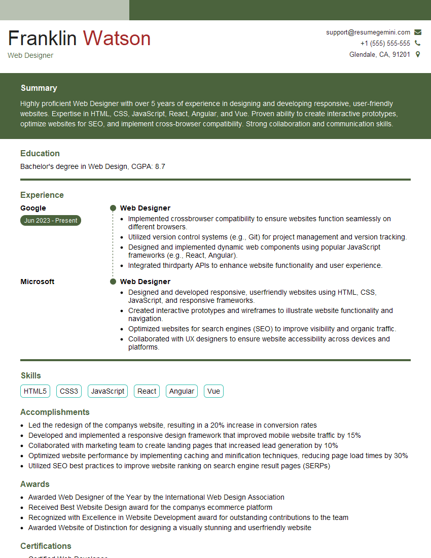
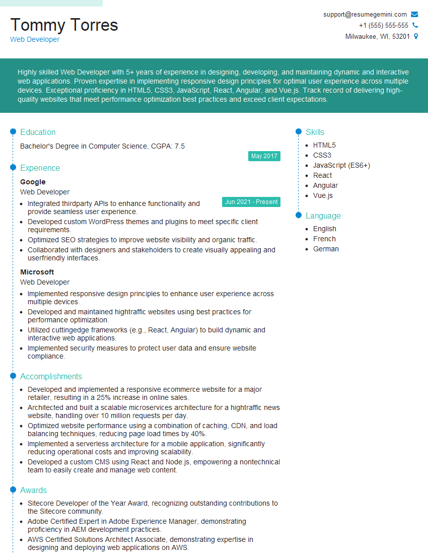
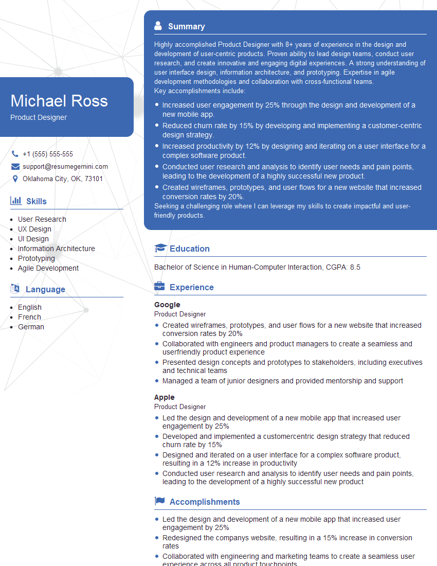
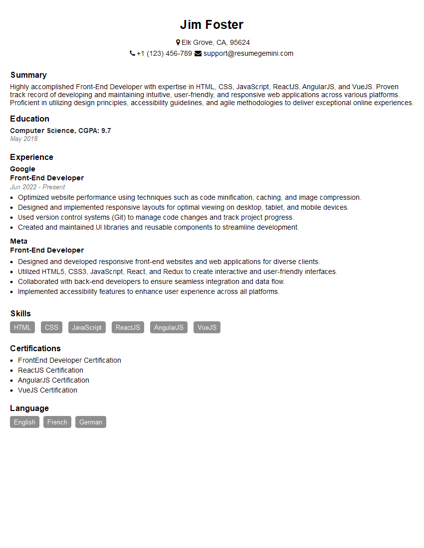
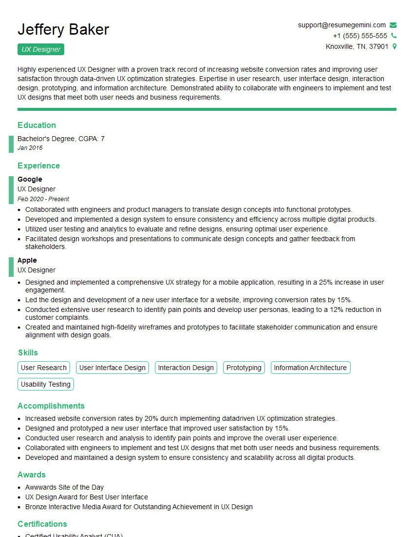
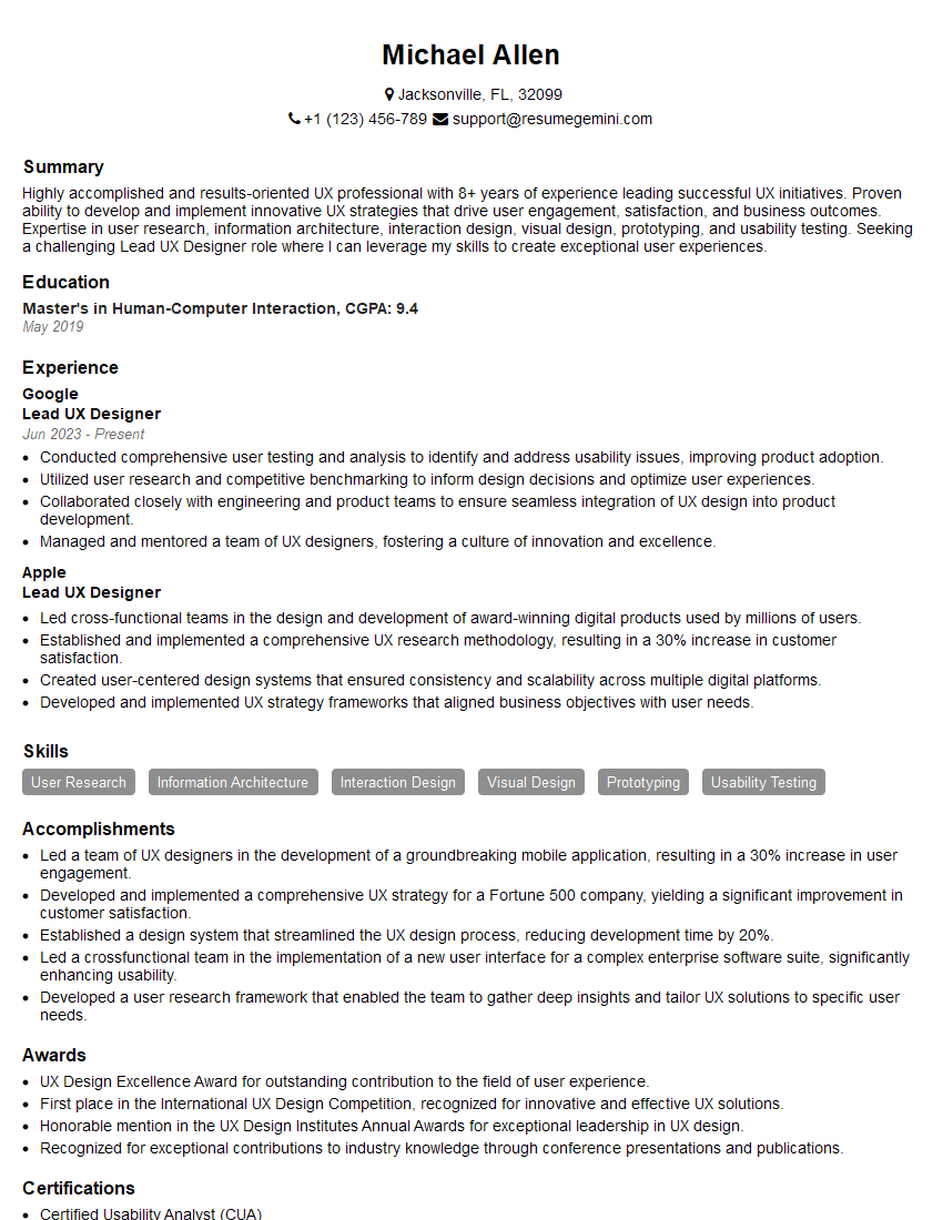
Mastering Web Design Principles is crucial for career advancement in the ever-evolving digital landscape. A strong understanding of these principles allows you to create user-centered, effective, and aesthetically pleasing websites. To increase your job prospects, create an ATS-friendly resume that highlights your skills and experience. ResumeGemini is a trusted resource to help you build a professional and impactful resume. Examples of resumes tailored to showcasing expertise in Web Design Principles are available to guide you. Invest the time to craft a compelling resume – it’s your first impression on potential employers.
Explore more articles
Users Rating of Our Blogs
Share Your Experience
We value your feedback! Please rate our content and share your thoughts (optional).
What Readers Say About Our Blog
Live Rent Free!
https://bit.ly/LiveRentFREE
Interesting Article, I liked the depth of knowledge you’ve shared.
Helpful, thanks for sharing.
Hi, I represent a social media marketing agency and liked your blog
Hi, I represent an SEO company that specialises in getting you AI citations and higher rankings on Google. I’d like to offer you a 100% free SEO audit for your website. Would you be interested?

